The greatest value of a picture is when it forces us to notice what we never expected to see.
-- John W. Tukey
numbers vs plots
dino#> # A tibble: 142 x 2#> x y#> <dbl> <dbl>#> 1 55.4 97.2#> 2 51.5 96.0#> 3 46.2 94.5#> 4 42.8 91.4#> 5 40.8 88.3#> 6 38.7 84.9#> # … with 136 more rows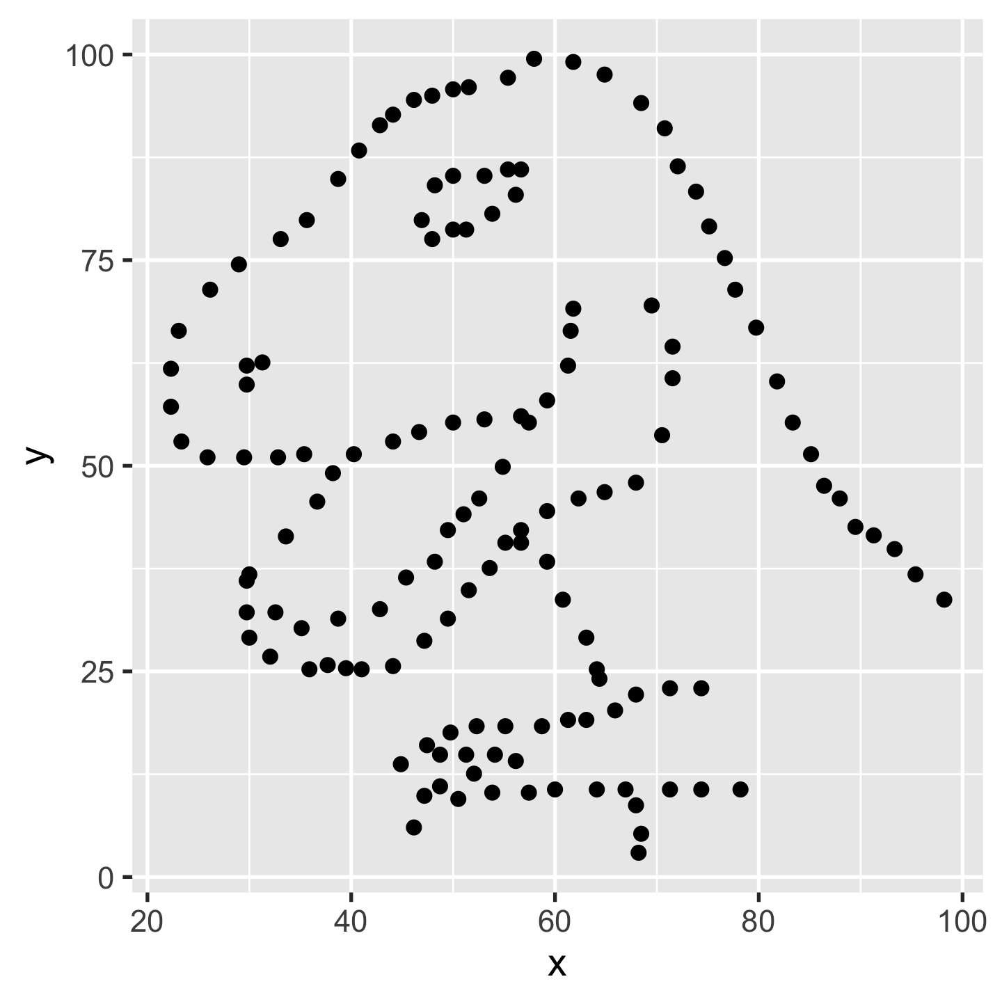
numbers vs plots
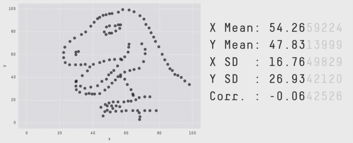
image credit: Steph Locke
Named charts
- Bar plot
barplot(as.matrix(sci_tbl$count), legend = sci_tbl$dept)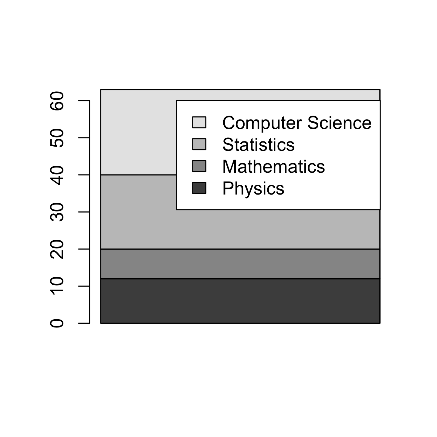
- Pie chart
pie(sci_tbl$count, labels = sci_tbl$dept)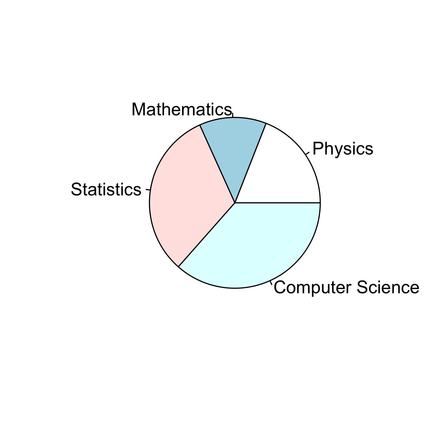
Grammar makes language expressive. A language consisting of words and no grammar (statement = word) expresses only as many ideas as there are words. By specifying how words are combined in statements, a grammar expands a language’s scope.
library(ggplot2)ggplot(data = sci_tbl) + geom_bar( aes(x = "", y = count, fill = dept), stat = "identity" )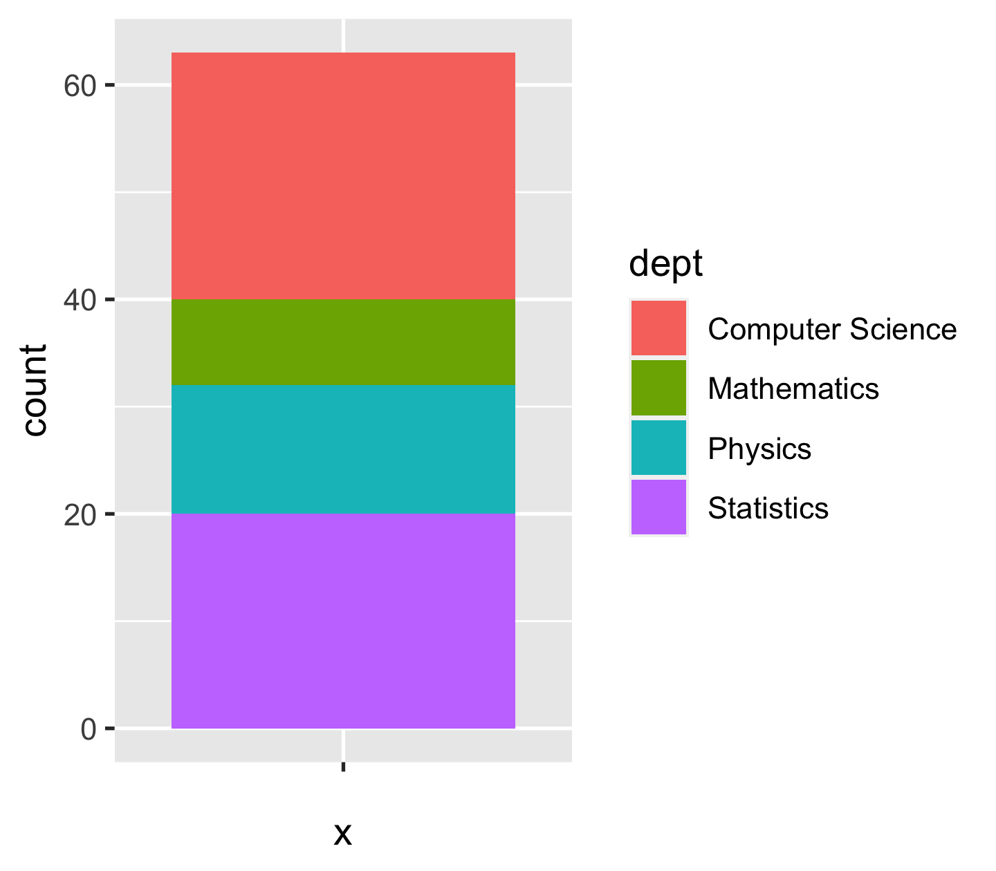
ggplot(data = sci_tbl) + geom_bar( aes(x = "", y = count, fill = dept), stat = "identity" ) + coord_polar(theta = "y")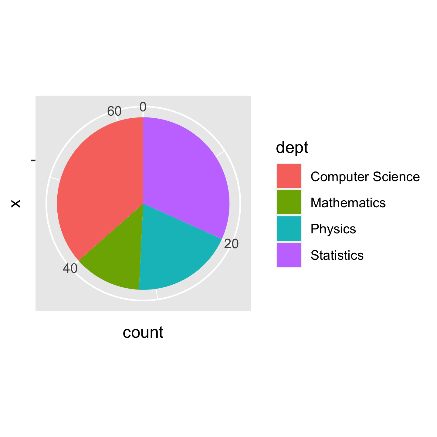
Layers: a bar chart 📊
ggplot(data = sci_tbl, mapping = aes(x = dept, y = count)) + layer(geom = "bar", stat = "identity", position = "identity")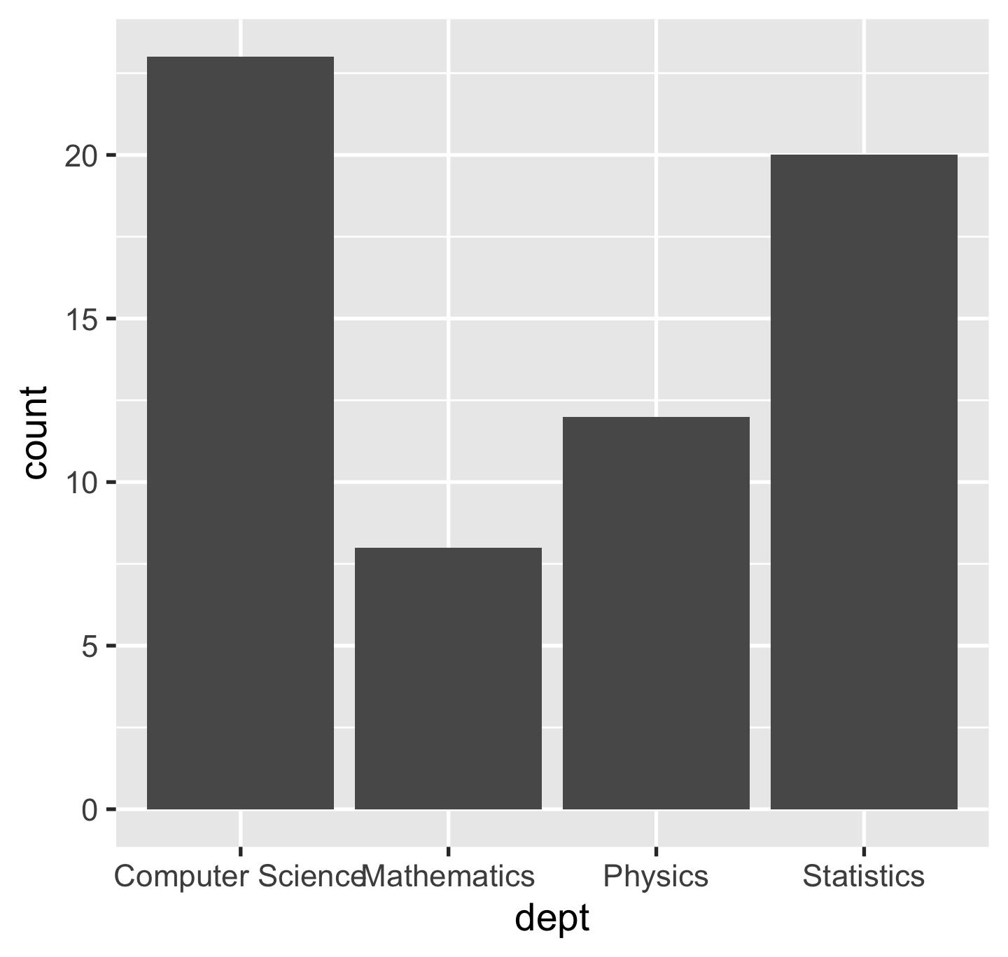
Aesthetic mapping: positional
p <- ggplot(sci_tbl, aes(x = dept, y = count))p
Geoms (a shorthand to layer())
p + geom_bar(stat = "identity")
p + geom_col()stat = "identity"leaves data as is.geom_col()is a shortcut togeom_bar(stat = "identity").
Generally, we use geom_*() instead of layer() in practice.
Geoms
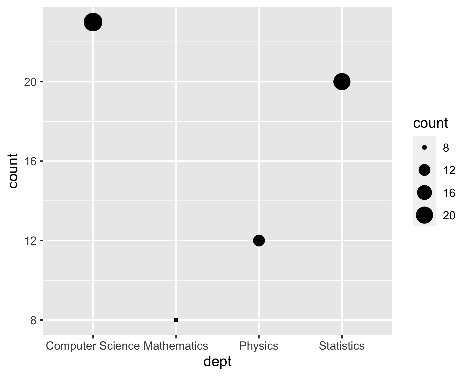
p + geom_point()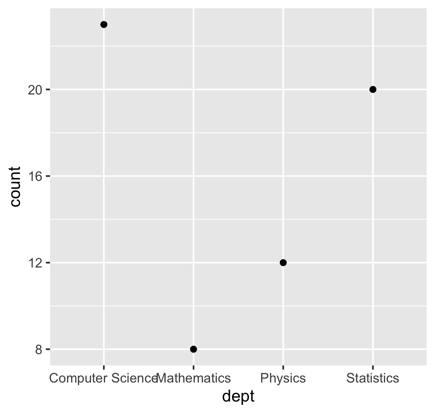
p + geom_segment(aes(xend = dept, y = 0, yend = count))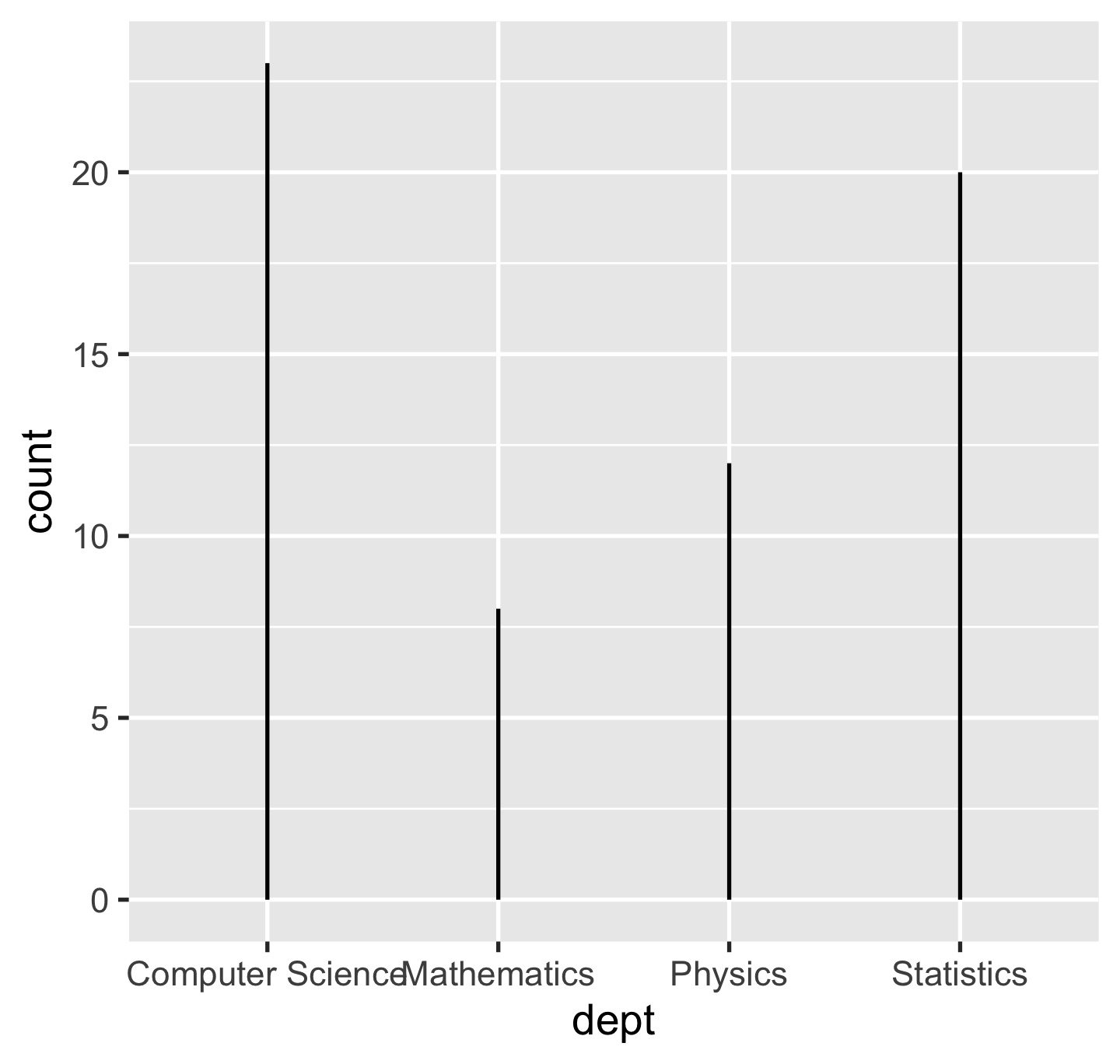
Composite geoms: lollipop 🍭 = points + segments
p + geom_point() + geom_segment(aes(xend = dept, y = 0, yend = count))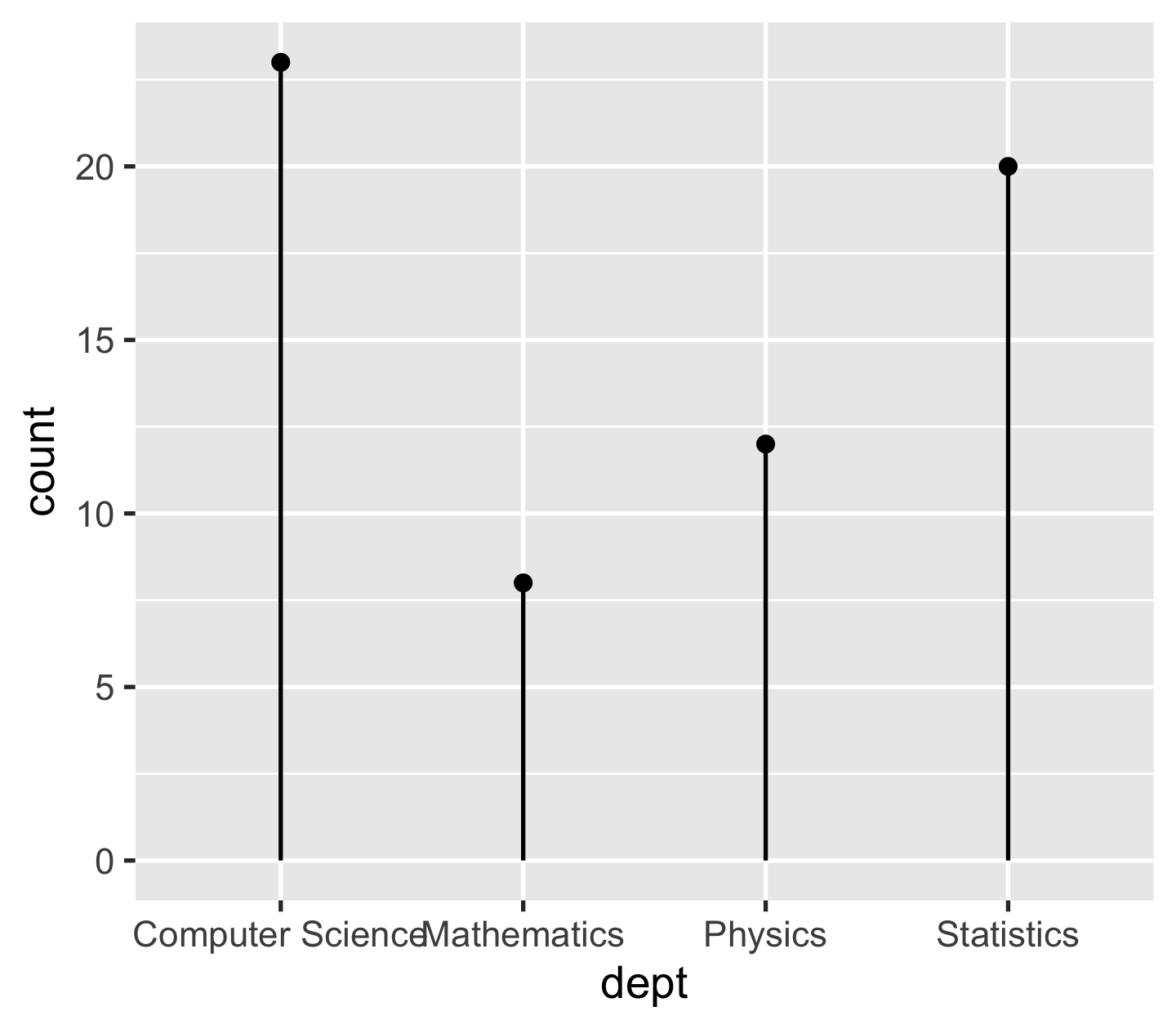
Stats
ggplot(sci_tbl, aes(x = dept, y = count)) + geom_bar(stat = "identity")
ggplot(sci_tbl0, aes(x = dept)) + geom_bar(stat = "count")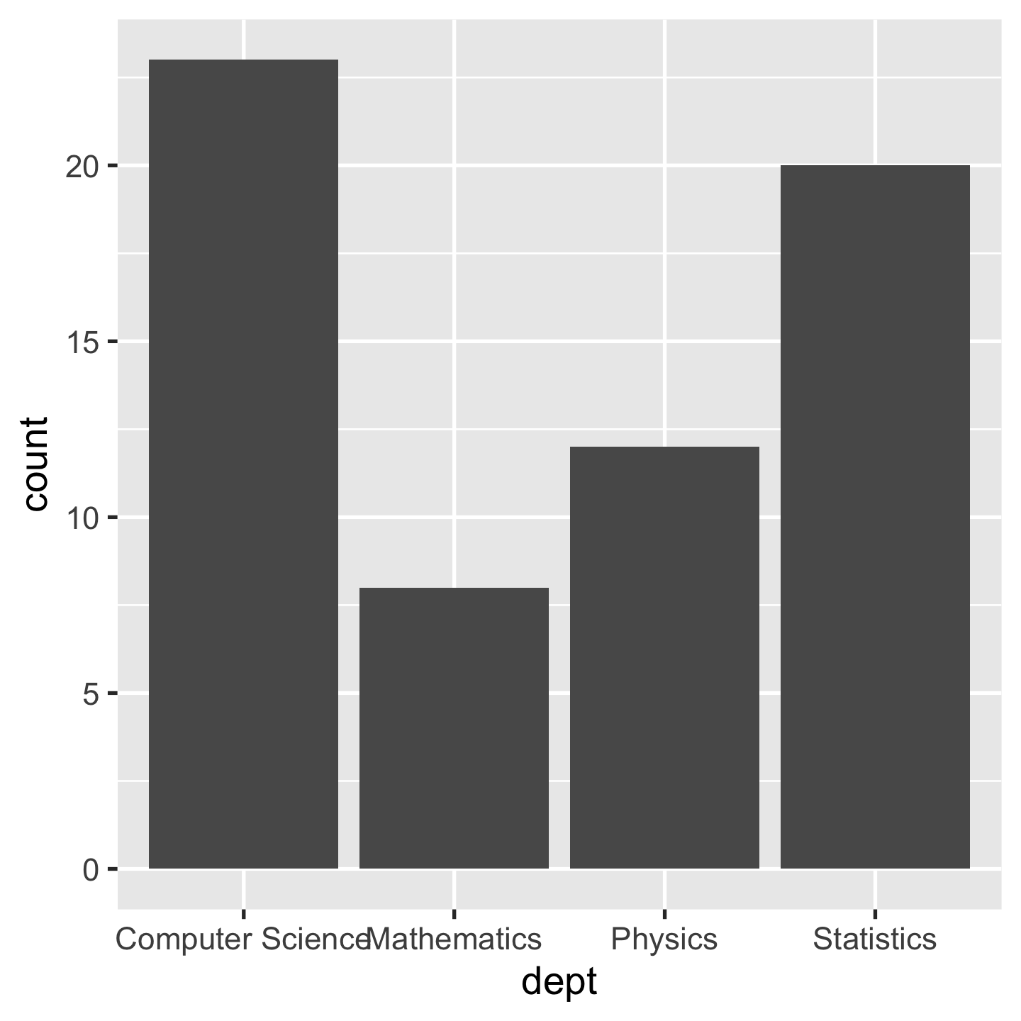
Aesthetic mapping: visual
p + geom_col(aes(colour = dept))
p + geom_col(aes(fill = dept))
Mapping variables / Setting constants
p + geom_col(aes(fill = dept))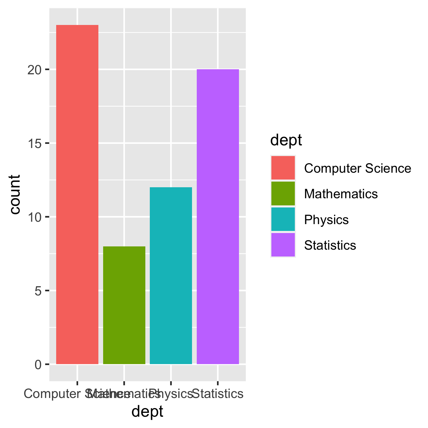
p + geom_col(fill = "#756bb1")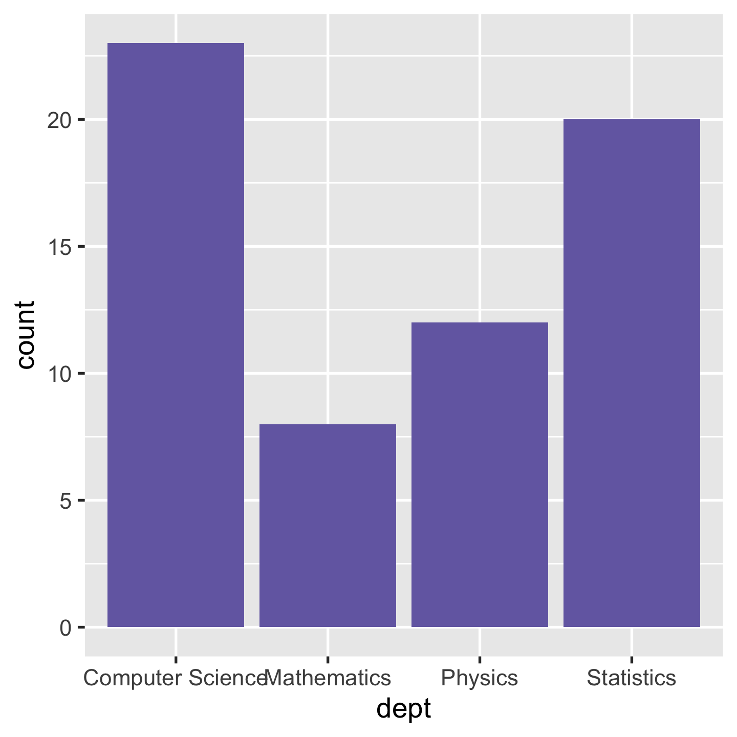
Mapping variables + Setting constants
p + geom_col(aes(fill = dept), colour = "#000000")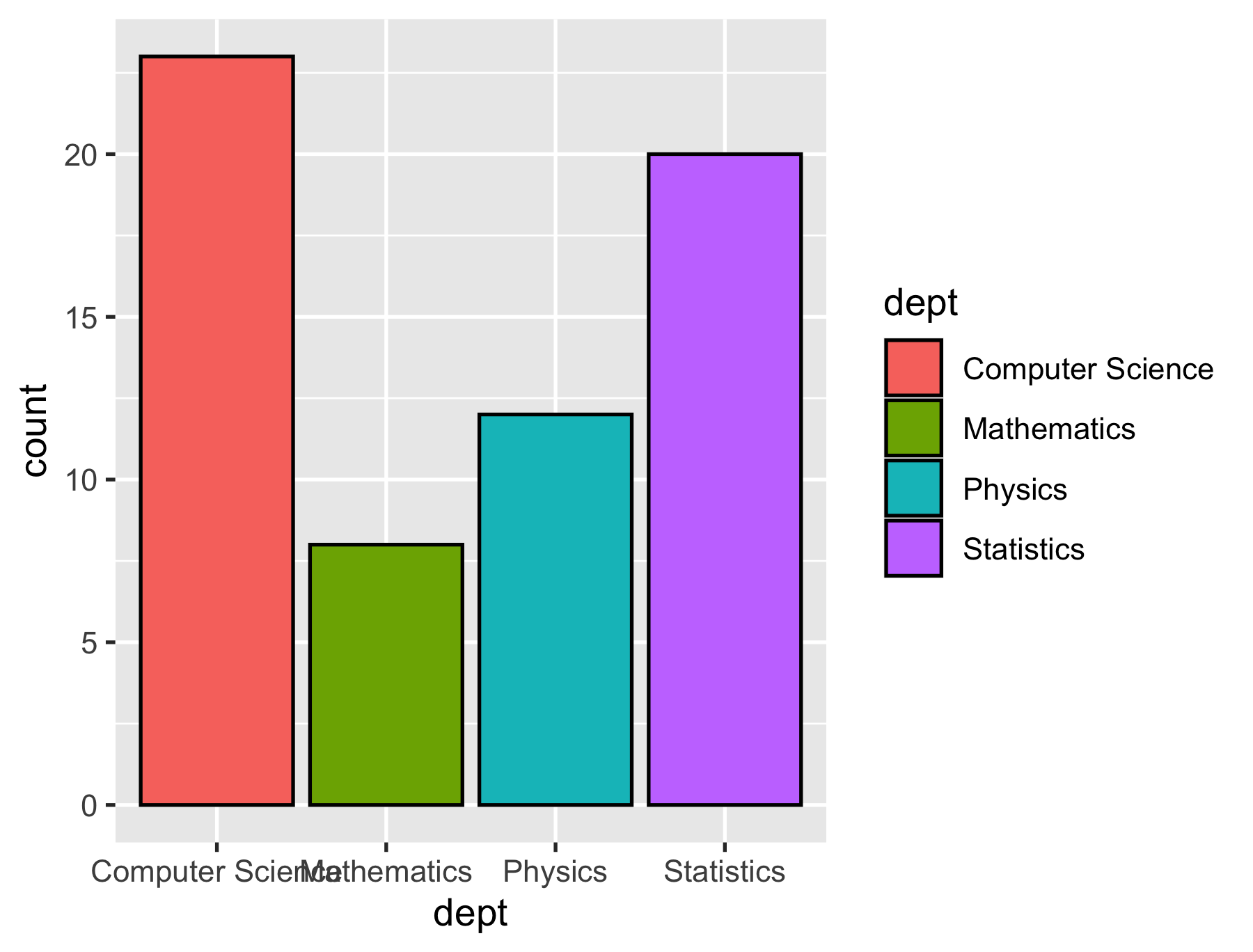
Visual aesthetics
colour/color,fill:- named colours, e.g.
"red" - RGB specification, e.g.
"#756bb1"
- named colours, e.g.
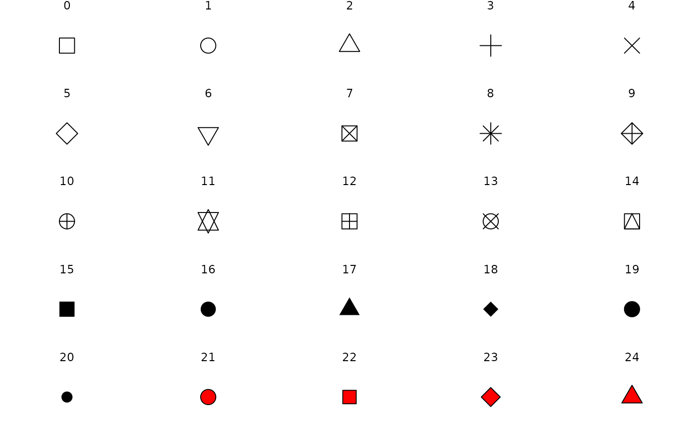
alpha: opacity between 0 and 1shape:- an integer between 0 and 25
- a single string, e.g.
"triangle open"
linetype:- an integer between 0 and 6
- a single string, e.g.
"dashed"
size,radius: a numerical value (in millimetres)
Your turn
Describe a bubble chart in terms of grammar of graphics.
Coords
- Coordinate systems
coord_cartesian()(default)coord_flip()xandy)coord_map()coord_polar()
p + geom_col(aes(fill = dept)) + coord_polar(theta = "y")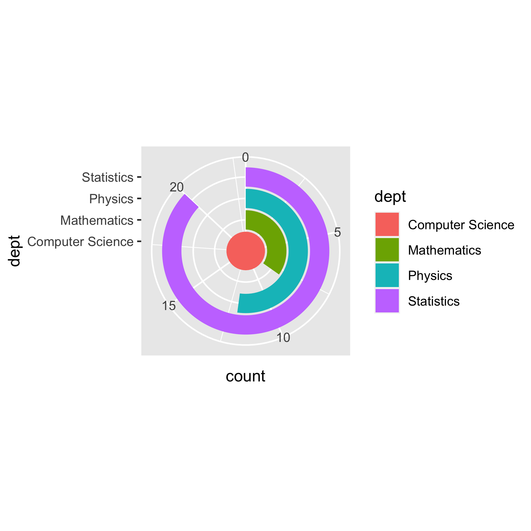
Themes: modify the look
- Built-in ggplot themes
theme_grey()/theme_gray()theme_bw(),theme_linedraw()theme_light(),theme_dark()theme_minimal(),theme_classic()theme_void()
p + geom_col(aes(fill = dept)) + theme_bw()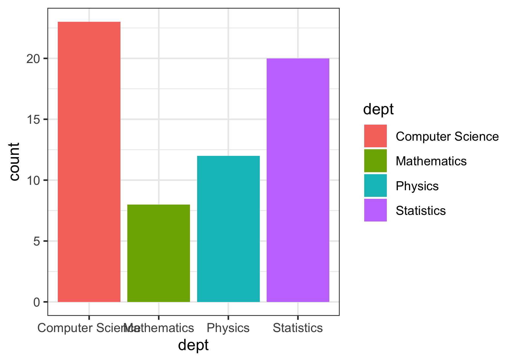
Themes: modify the look
- Many R packages provide themes.
library(ggthemes)p + geom_col(aes(fill = dept)) + theme_economist()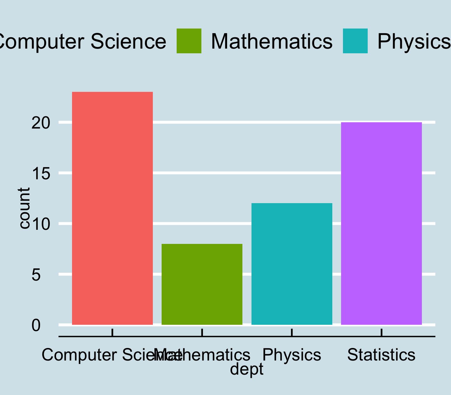
Modify the look of texts with element_text()
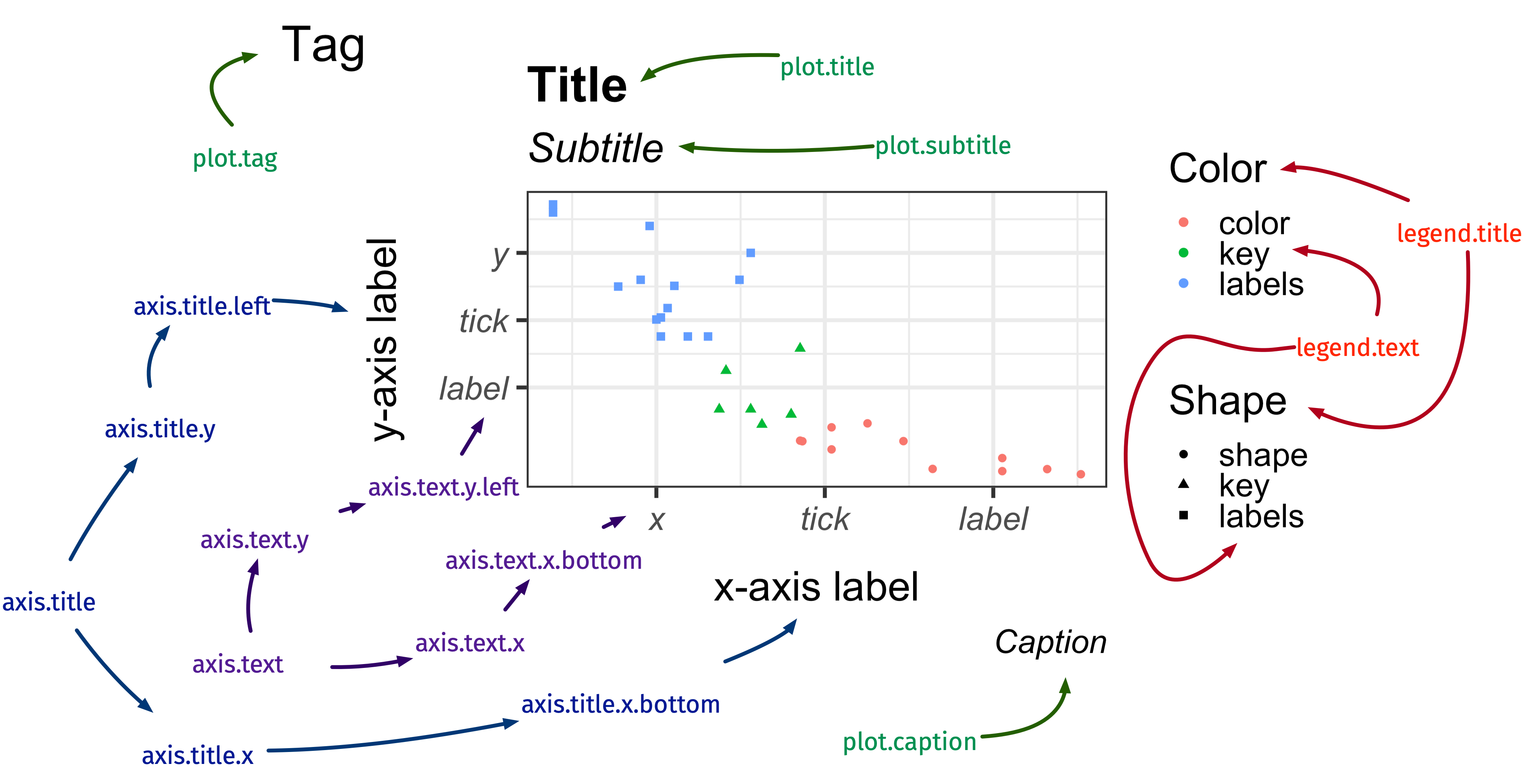
image credit: Emi Tanaka
Modify the look of texts with element_text()
p + geom_col(aes(fill = dept)) + theme(axis.text.x = element_text(angle = 30, vjust = 0.1))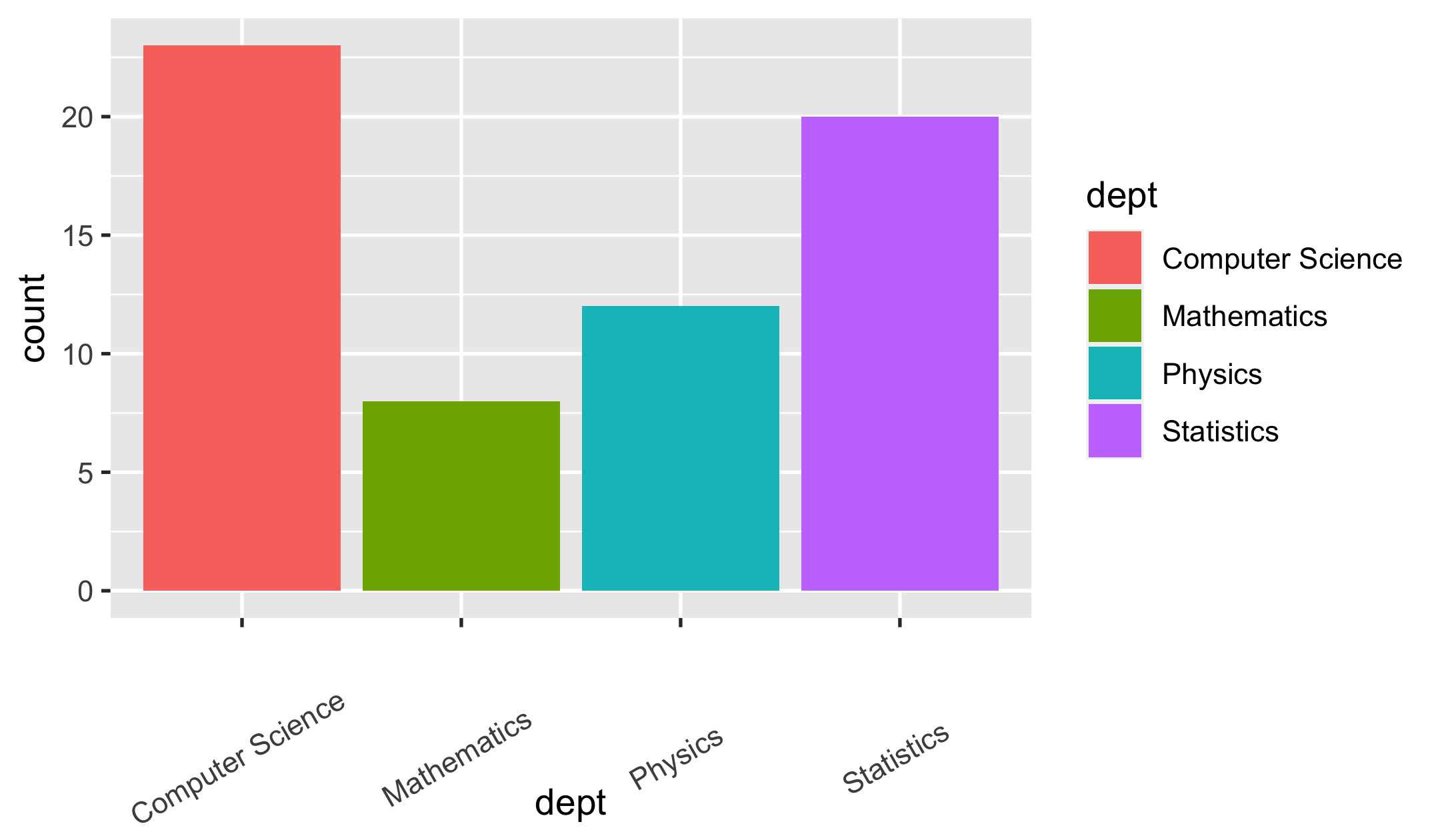
Modify the look of lines with element_line()
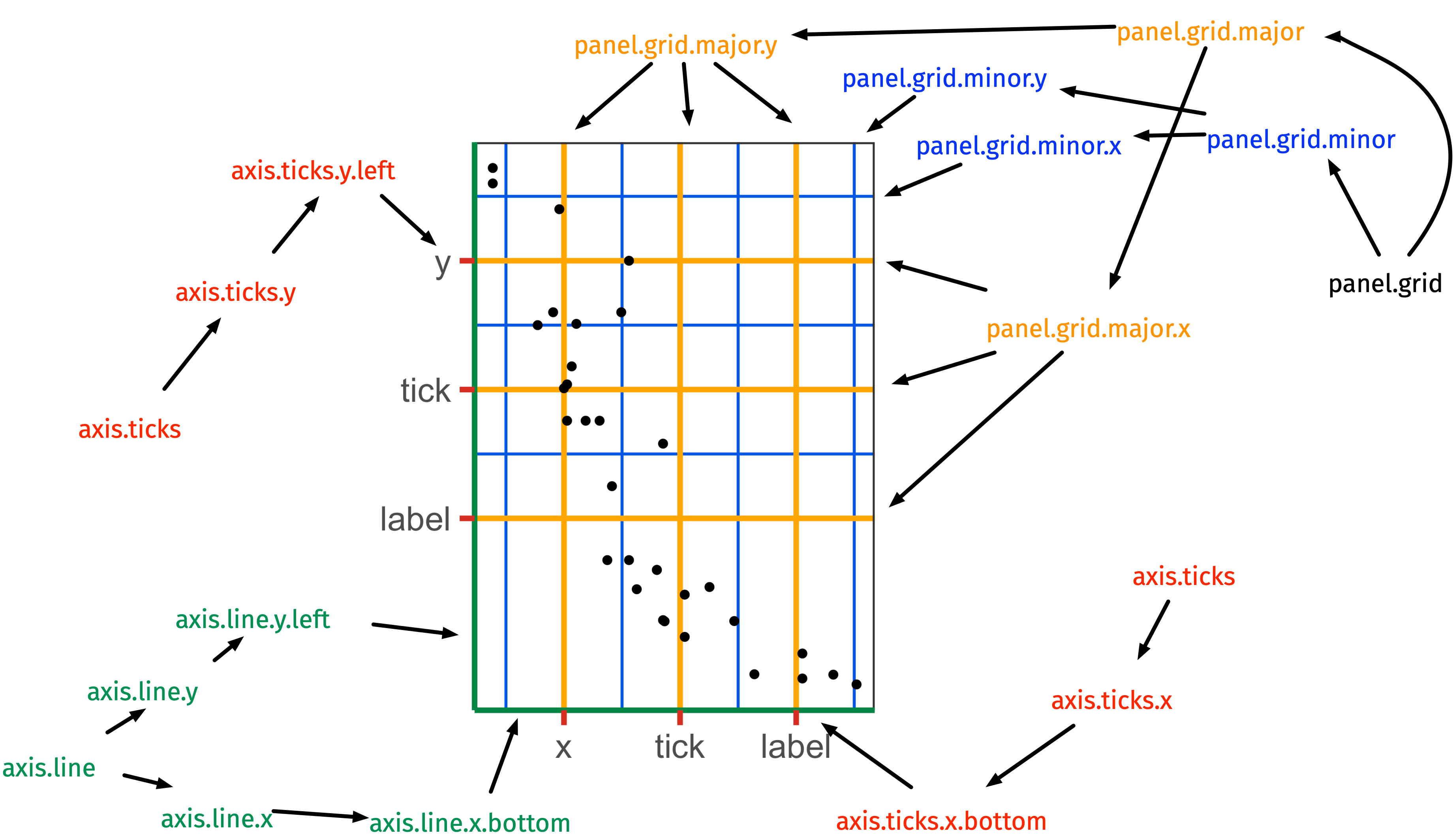
image credit: Emi Tanaka
Modify the look of regions with element_rect()
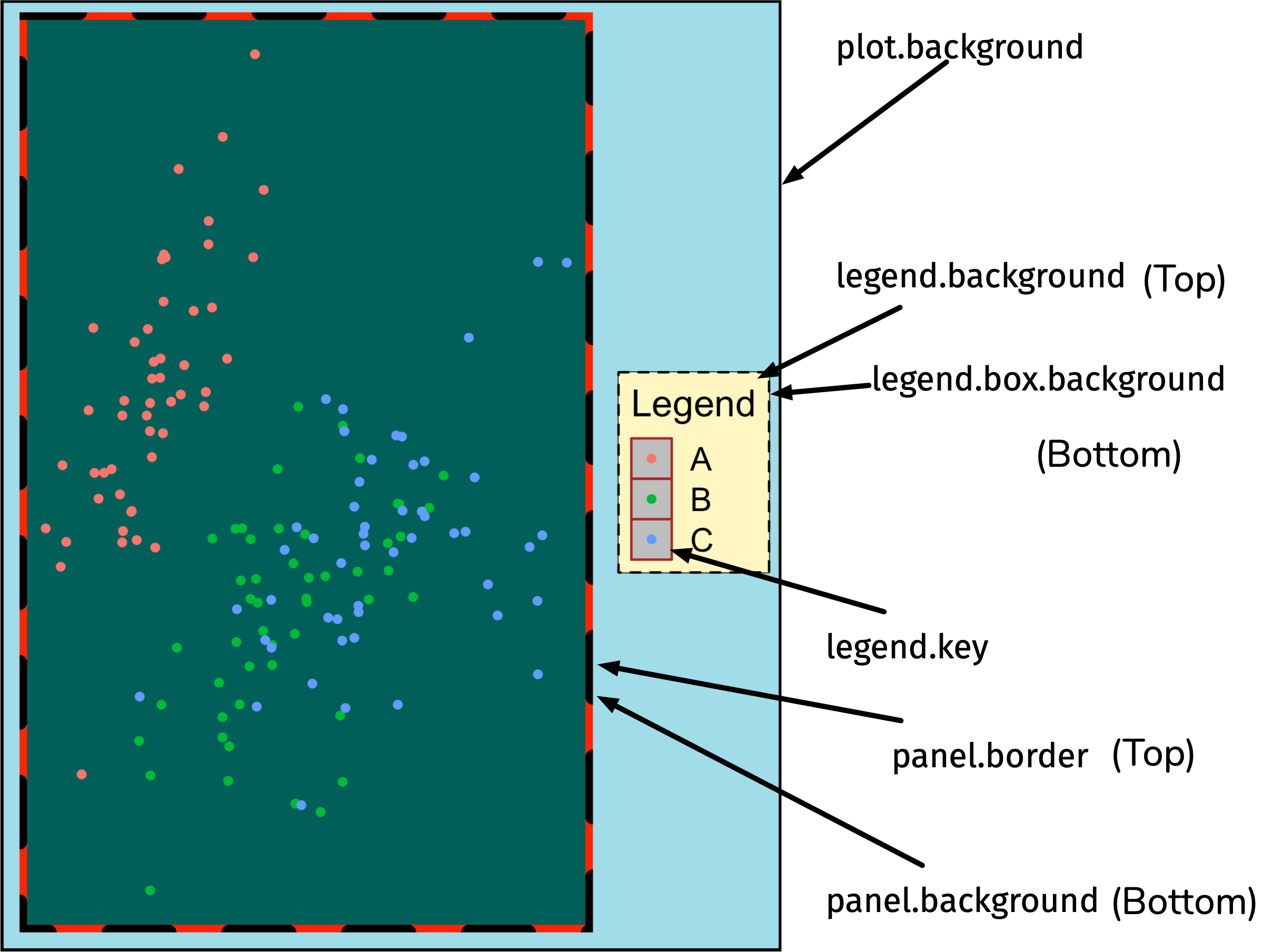
image credit: Emi Tanaka
Facets
p_mpg <- ggplot(mpg, aes(displ, cty)) + geom_point(aes(colour = drv))p_mpg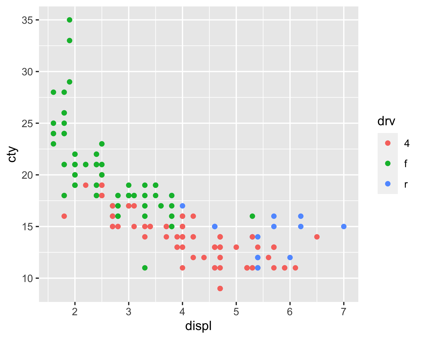
Facets
- facet_grid()
p_mpg + facet_grid(rows = vars(drv)) # facet_grid(~ drv)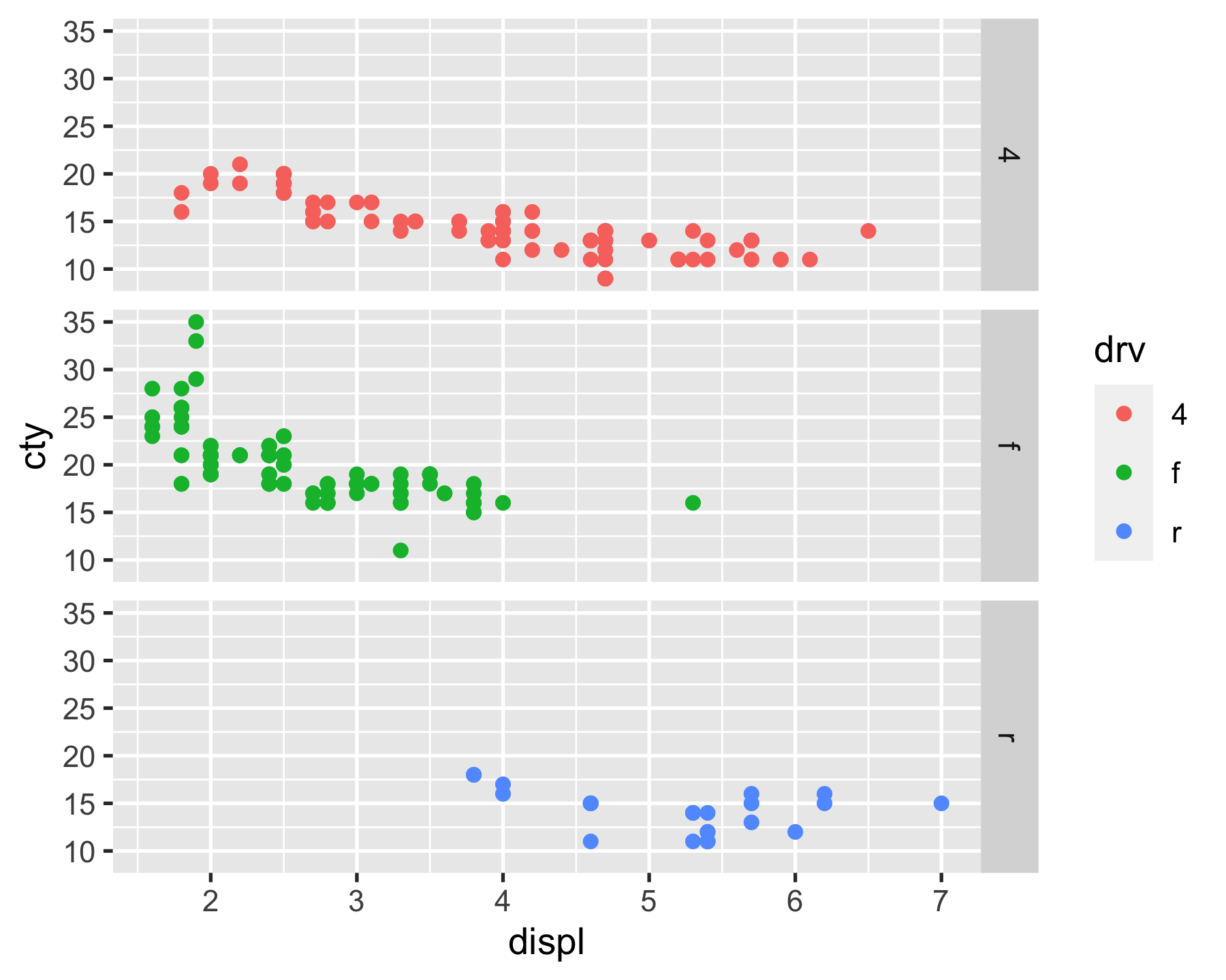
Facets
- facet_grid()
p_mpg + facet_grid(cols = vars(drv)) # facet_grid(drv ~ .)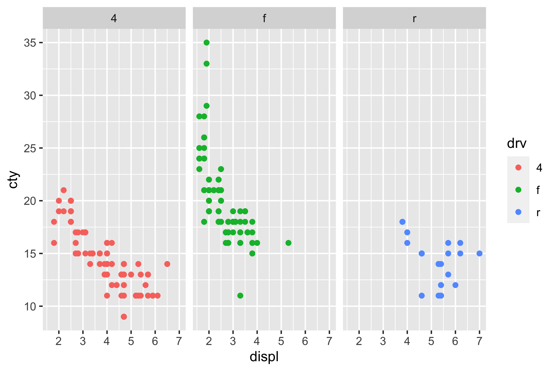
Facets
- facet_grid()
p_mpg + facet_grid(rows = vars(drv), cols = vars(cyl)) # facet_grid(cyl ~ drv)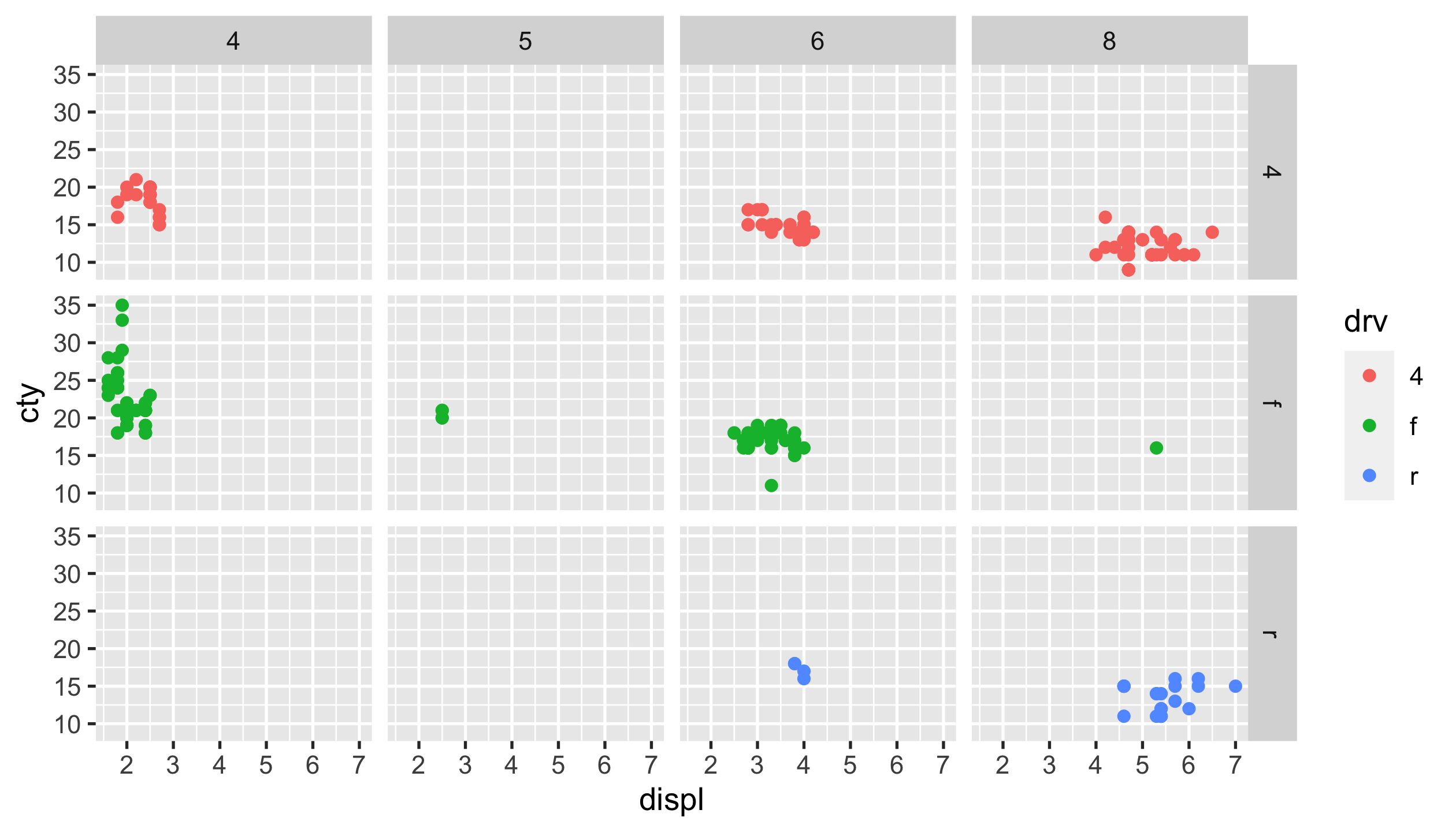
Facets
- facet_grid()
- facet_wrap()
p_mpg + facet_wrap(vars(drv, cyl), ncol = 3) # facet_wrap(~ drv + cyl, ncol = 3)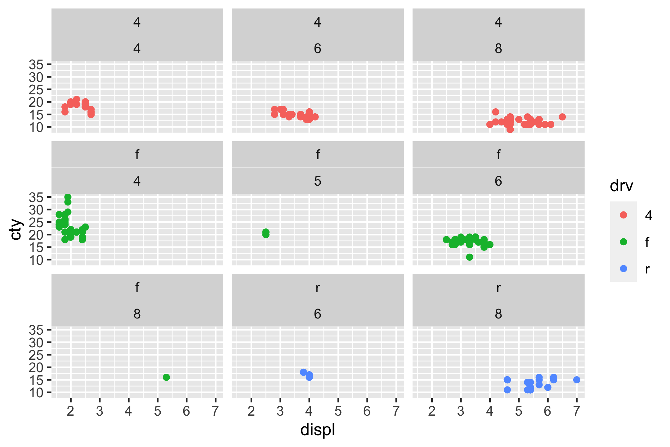
case study
- import
- skim
- vis
- Data analysis starts with questions (a.k.a. curiosity).
case study
- import
- skim
- vis
Are movies ratings consistent b/t IMDB & Rotten Tomatoes
ggplot(movies, aes(x = IMDB_Rating, y = Rotten_Tomatoes_Rating)) + geom_point(size = 0.5, alpha = 0.5) + geom_smooth(method = "gam") + theme(aspect.ratio = 1)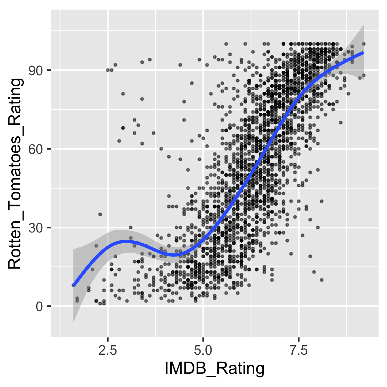
case study
- import
- skim
- vis
Are movies ratings consistent b/t IMDB & Rotten Tomatoes
ggplot(movies, aes(x = IMDB_Rating, y = Rotten_Tomatoes_Rating)) + geom_hex() + theme(aspect.ratio = 1)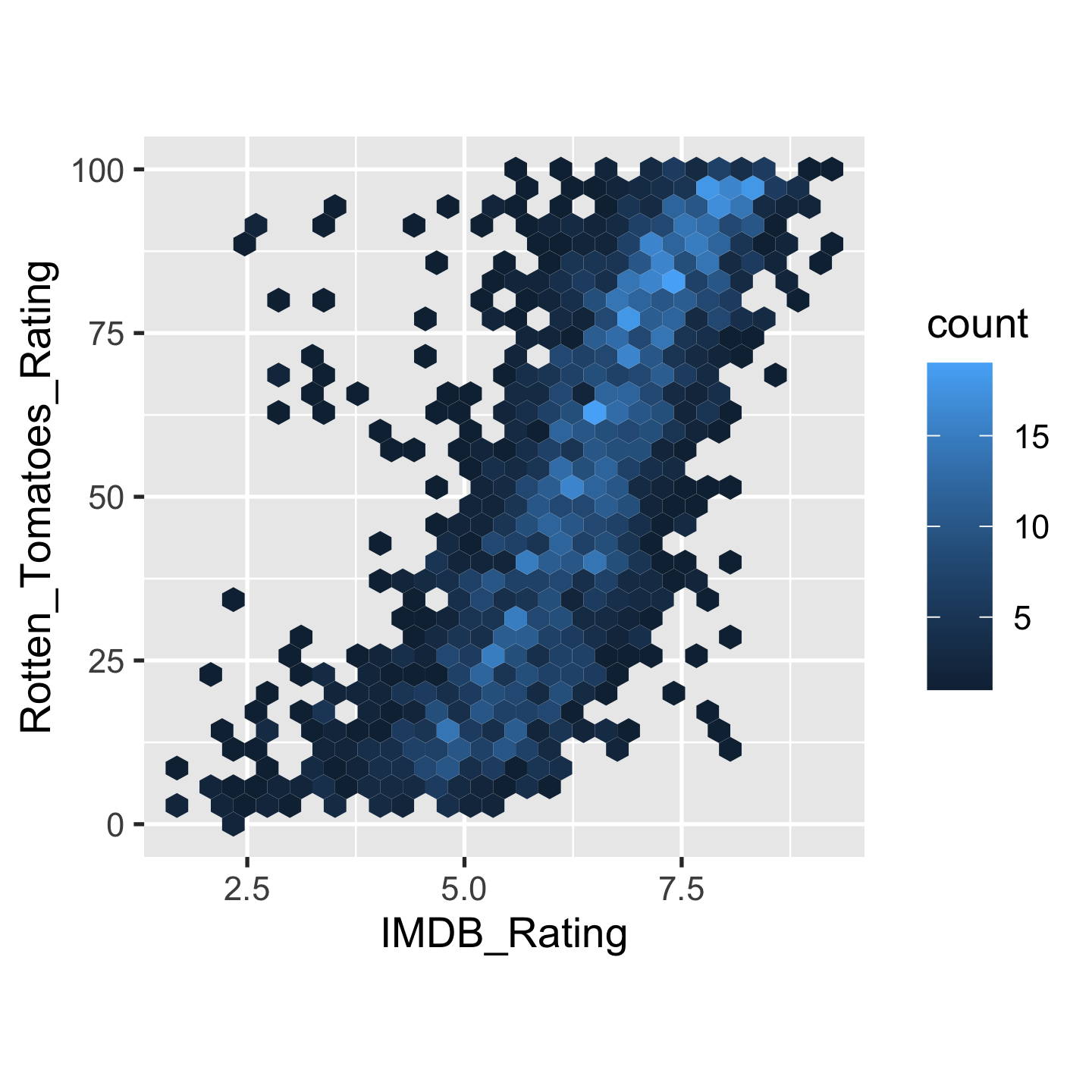
case study
- import
- skim
- vis
The popularity of major genre
ggplot(movies, aes(y = Major_Genre)) + geom_bar()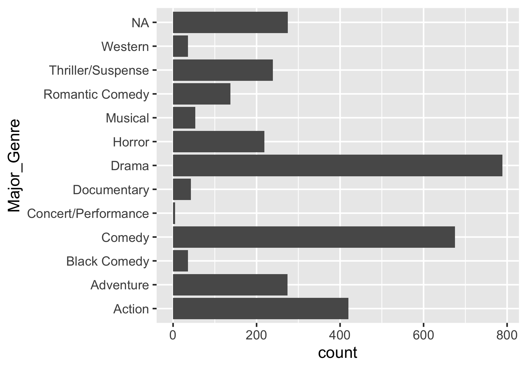
case study
- import
- skim
- vis
The likeness of major genre
ggplot(movies) + geom_boxplot(aes(x = IMDB_Rating, y = Major_Genre))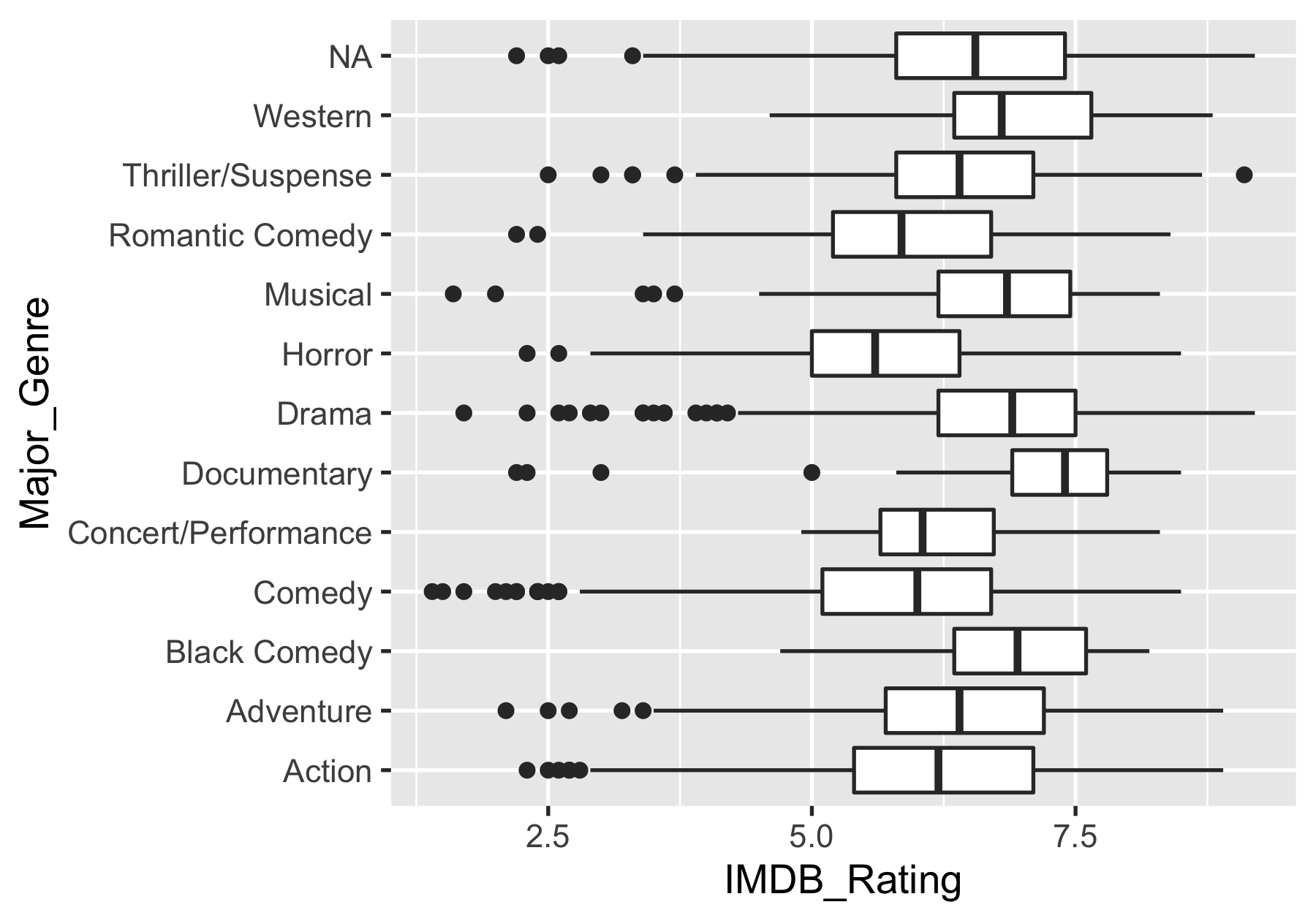
case study
- import
- skim
- vis
The likeness of major genre
ggplot(movies) + geom_density(aes(x = IMDB_Rating, fill = Major_Genre))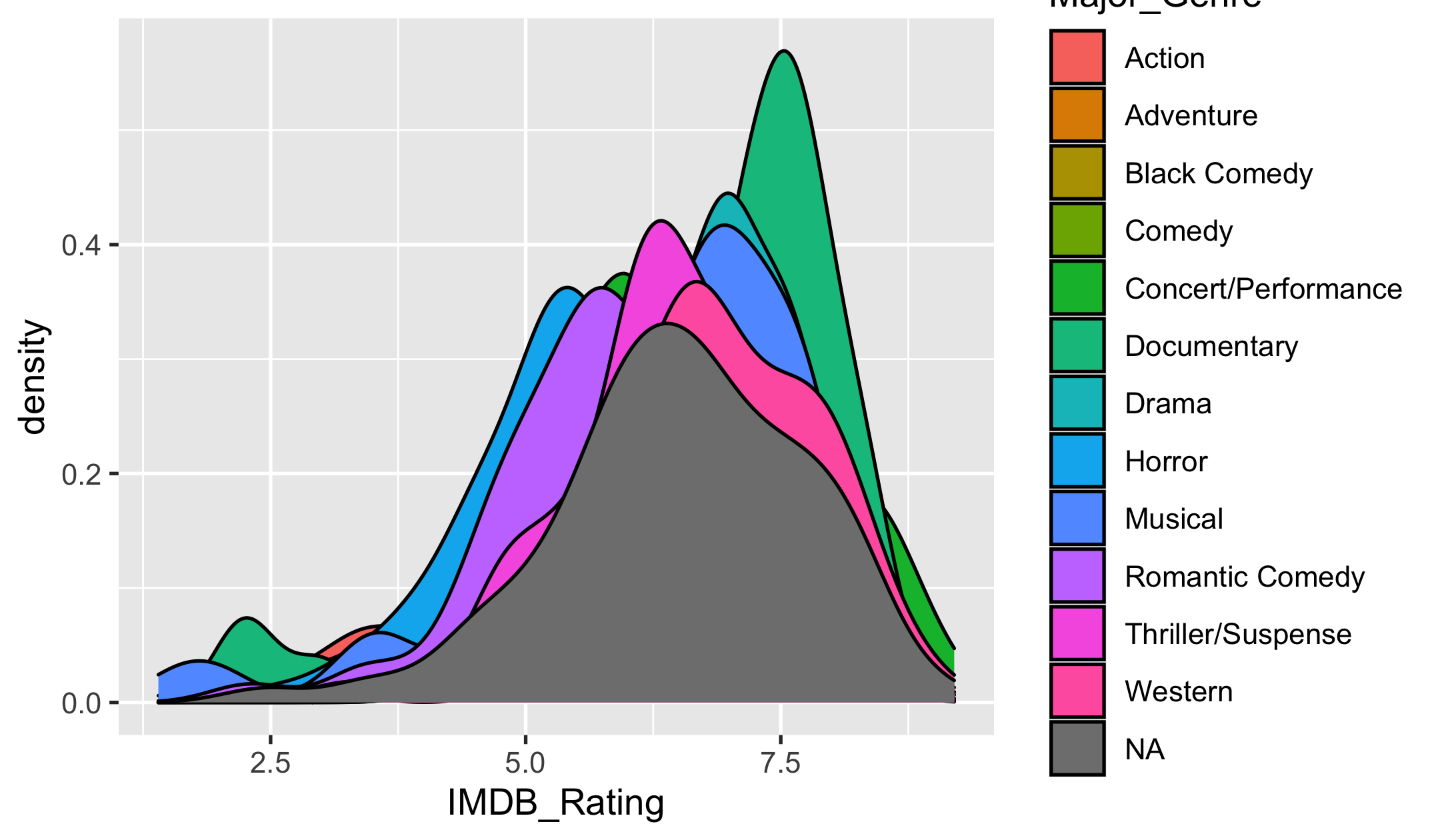
case study
- import
- skim
- vis
The likeness of major genre
library(ggridges)ggplot(movies, aes(x = IMDB_Rating, y = Major_Genre)) + geom_density_ridges(aes(fill = Major_Genre))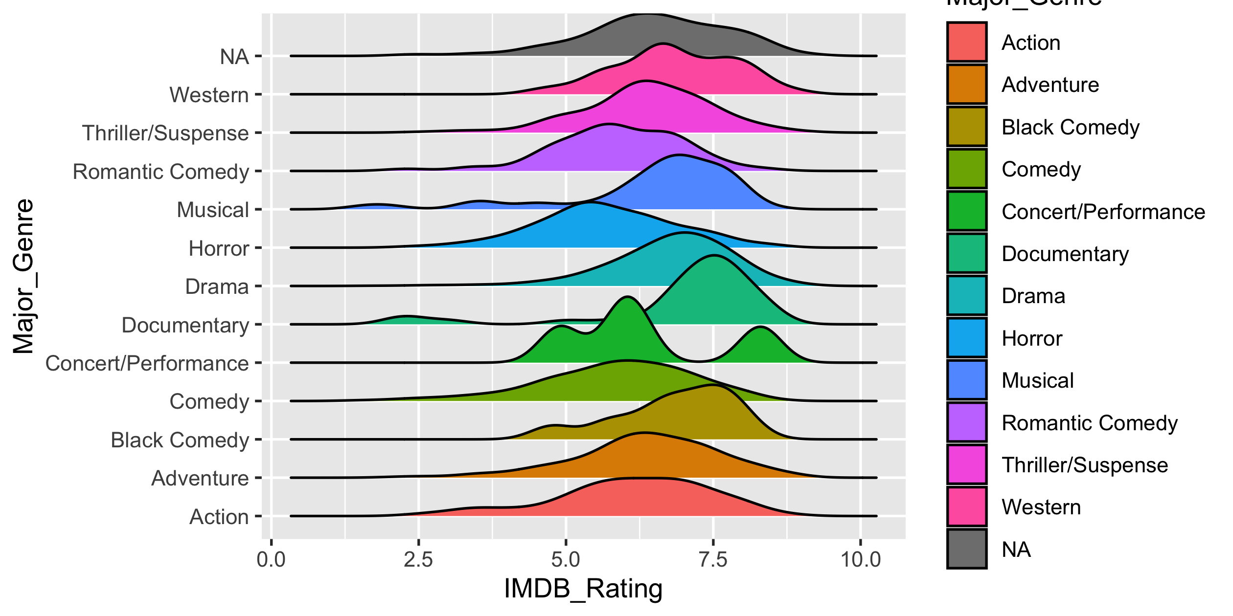
![]()
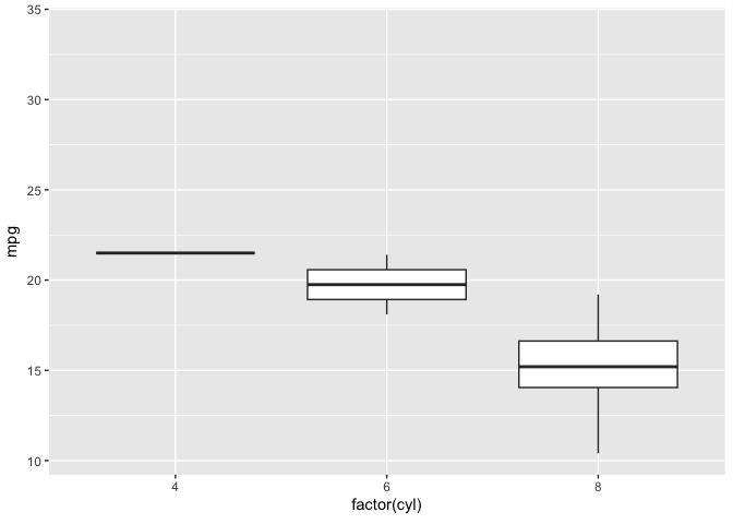
library(gganimate)ggplot(mtcars, aes(factor(cyl), mpg)) + geom_boxplot() + # Here comes the gganimate code transition_states( gear, transition_length = 2, state_length = 1 ) + enter_fade() + exit_shrink() + ease_aes('sine-in-out')
![]()
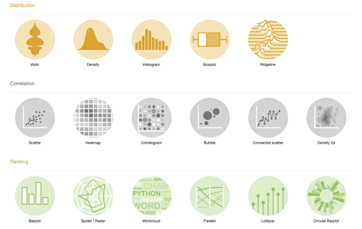
The R Graph Gallery