Preattentive processing
Preattentive processing

Preattentive processing
Preattentive processing colour > form (shape)


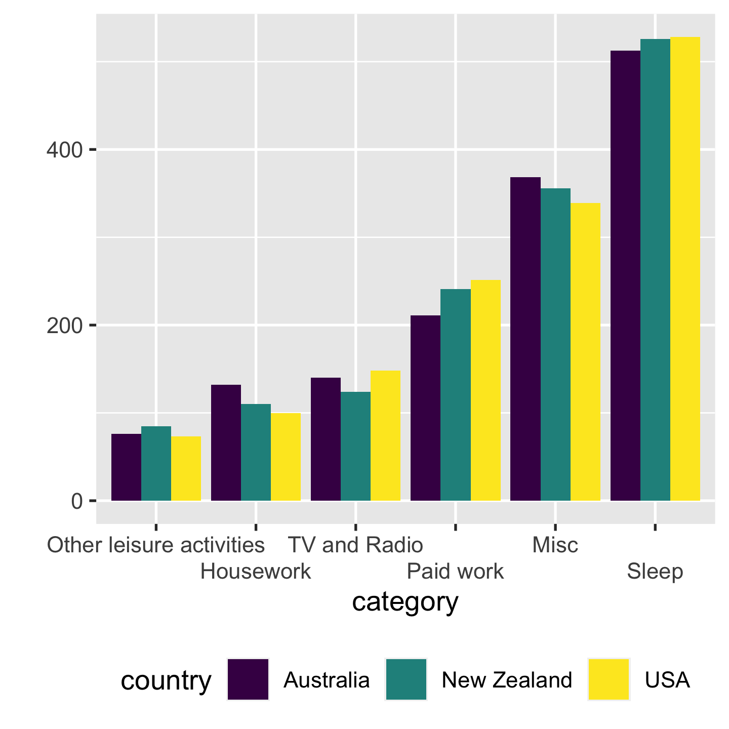
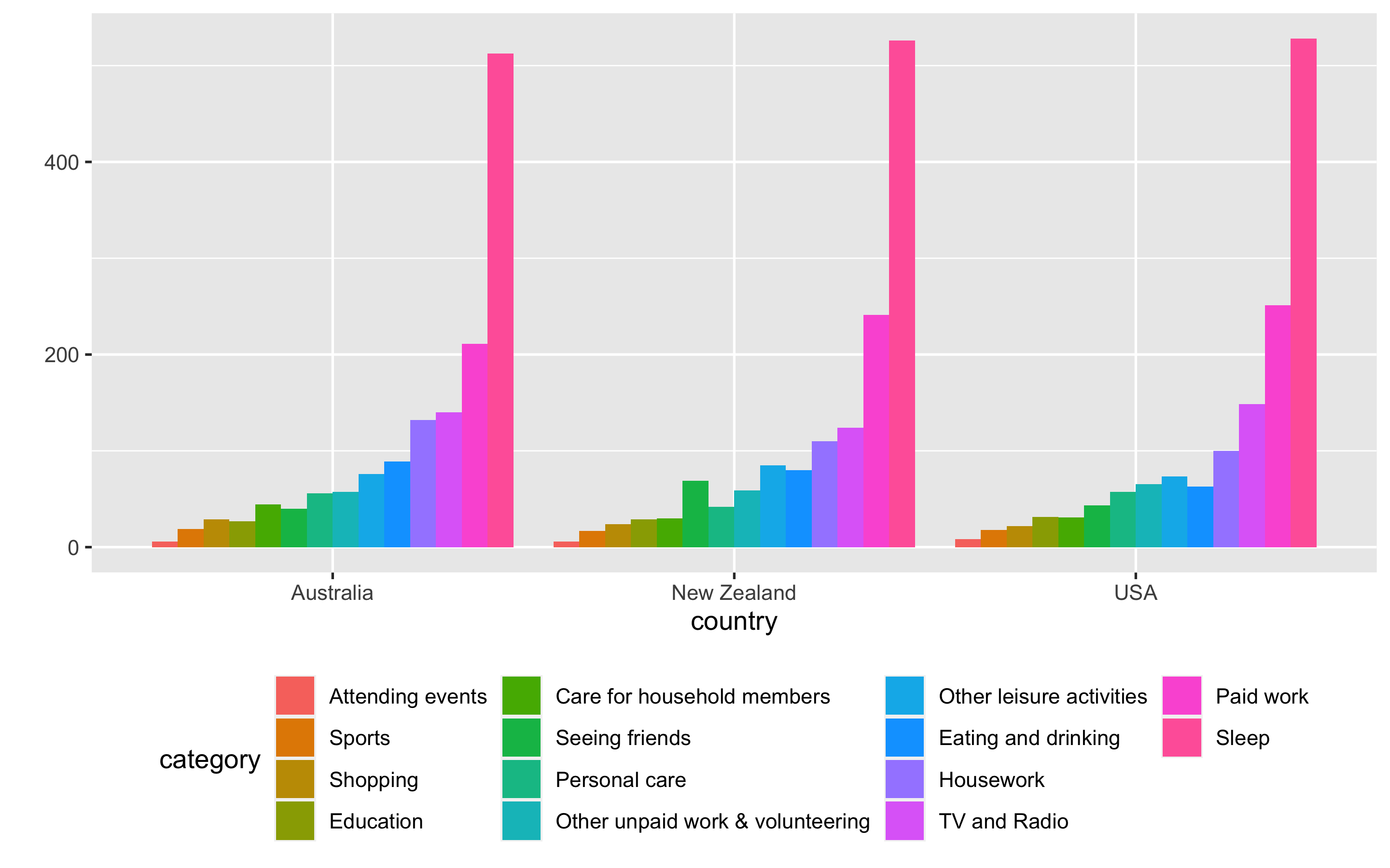
Proximity Make easy comparisons by grouping elements together
- compare time use by categories within each country
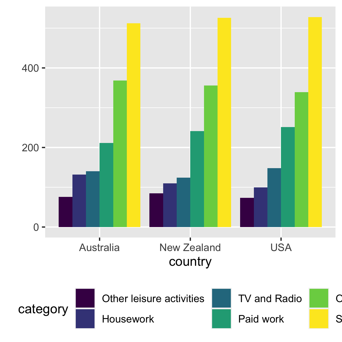
- compare time use by countries within each category
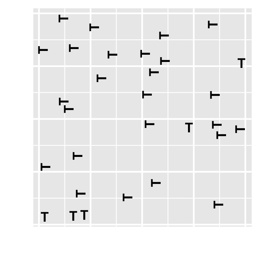
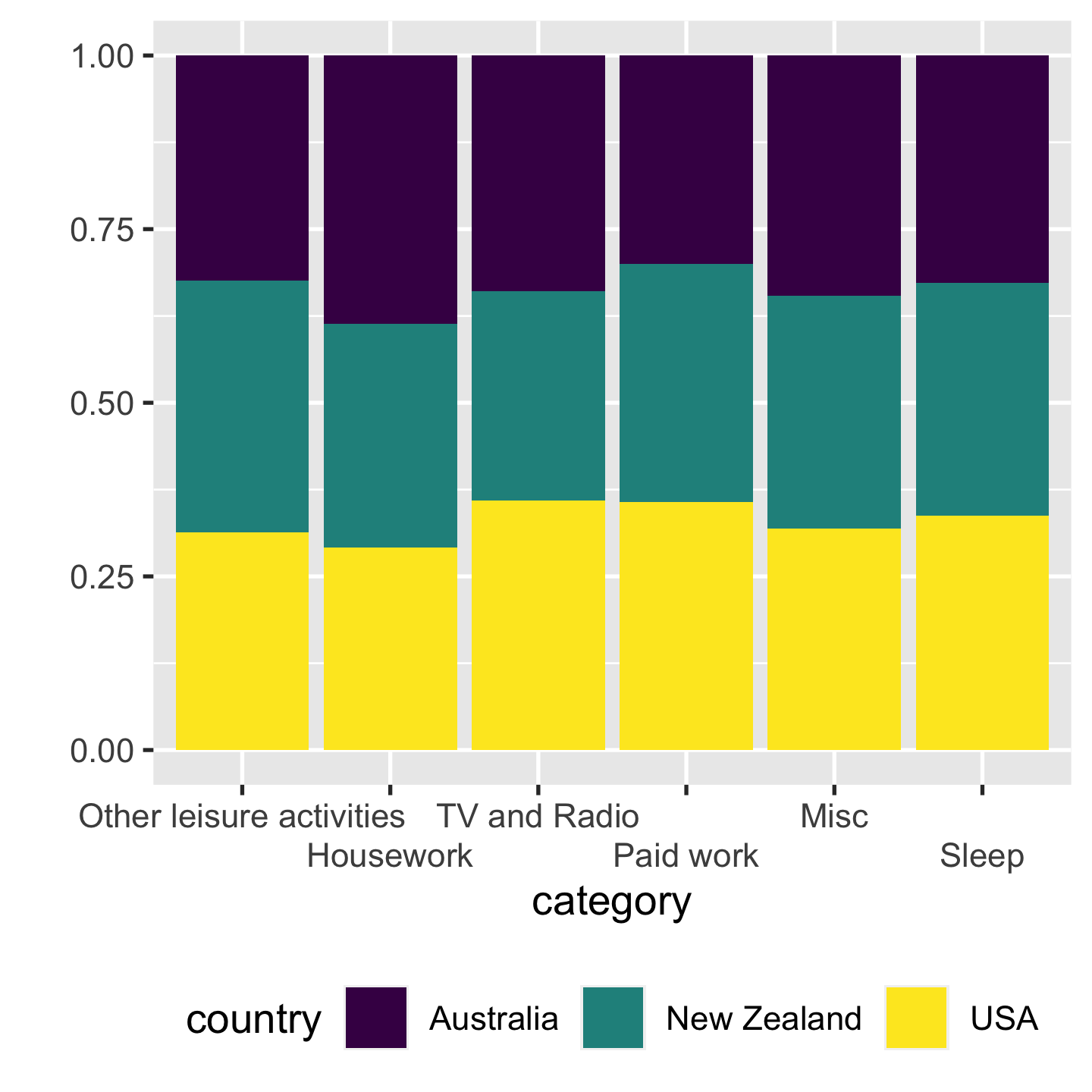
Position vs angle position > angle

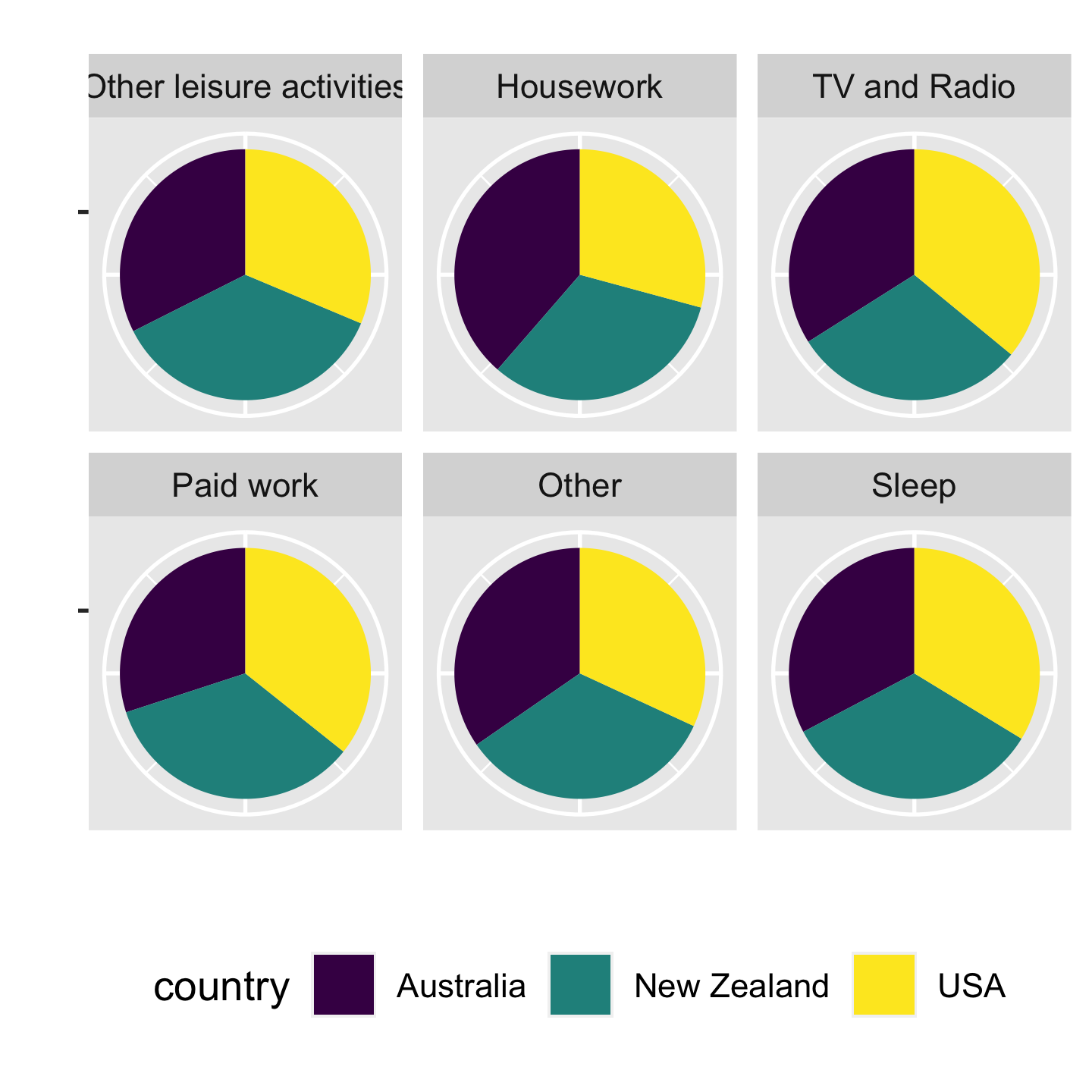 Pie charts are BAD‼️
Absolute vs relative positions absolute > relative

RGB
- Red (0-255): amount of red light
- Green (0-255): amount of green light
- Blue (0-255): amount of blue light

image credit: Claus O. Wilke
HSV
- Hue (0-360): hue of the colour
- Saturation (0-1): colourfulness relative to the brightness of the colour
- Value (0-1): subjective perception of amount of light emitted

image credit: Claus O. Wilke
HSL
- Hue (0-360): hue of the colour
- Lightness (0-1): brightness relative to the brightness of a illuminated white
- Saturation (0-1): colourfulness relative to the brightness of the colour

image credit: Claus O. Wilke
HCL aka polar LUV
- Hue (0-360): hue of the colour
- Chroma (0-180): degree of vividness of a colour
- Luminance (0-100): amount of light emitted

image credit: Claus O. Wilke
Encoding too much
Qualitative palettes for categorical data with no intrinsic ordering
colorspace::hcl_palettes("Qualitative", plot = TRUE, n = 7)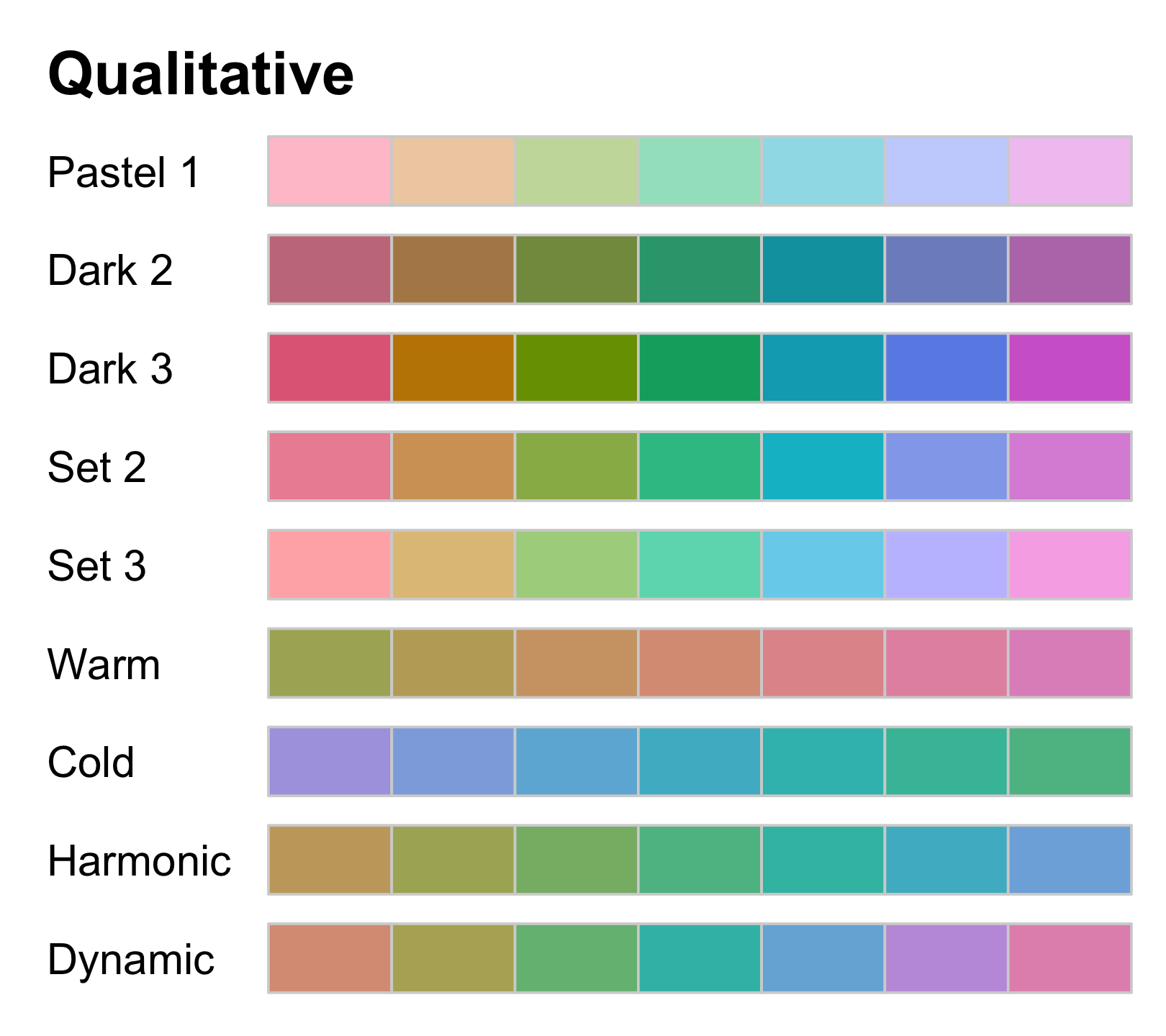
Sequential palettes for ordered data from high to low
colorspace::hcl_palettes("Sequential", plot = TRUE, n = 7)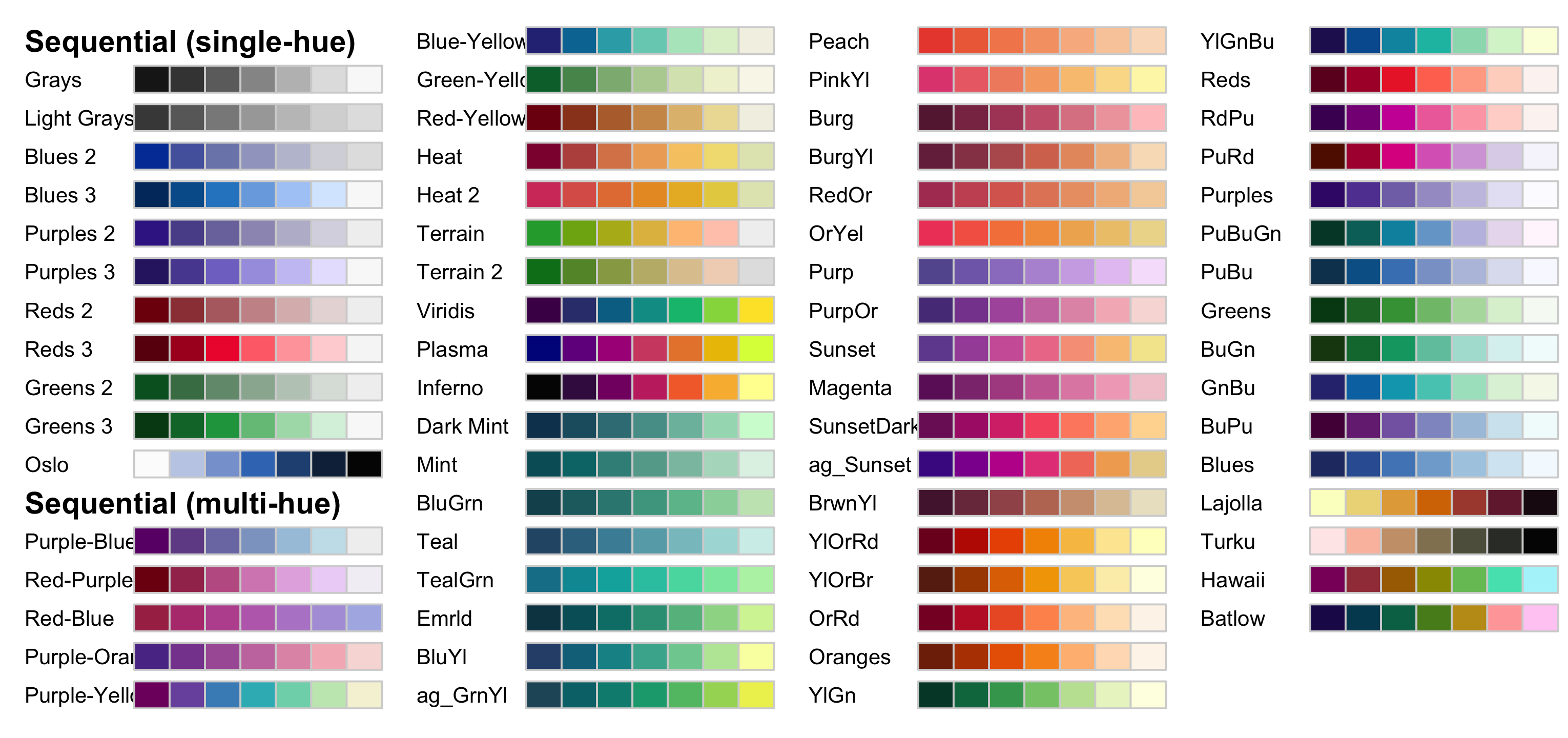
Diverging palettes for mid-range values and extremes at both ends
colorspace::hcl_palettes("Diverging", plot = TRUE, n = 7)
Use colour palettes
time_use %>% ggplot(aes(country, time_minutes)) + geom_col( aes(fill = category), position = "dodge") + scale_fill_brewer(palette = "Dark2") + labs(y = "") + theme(legend.position = "bottom")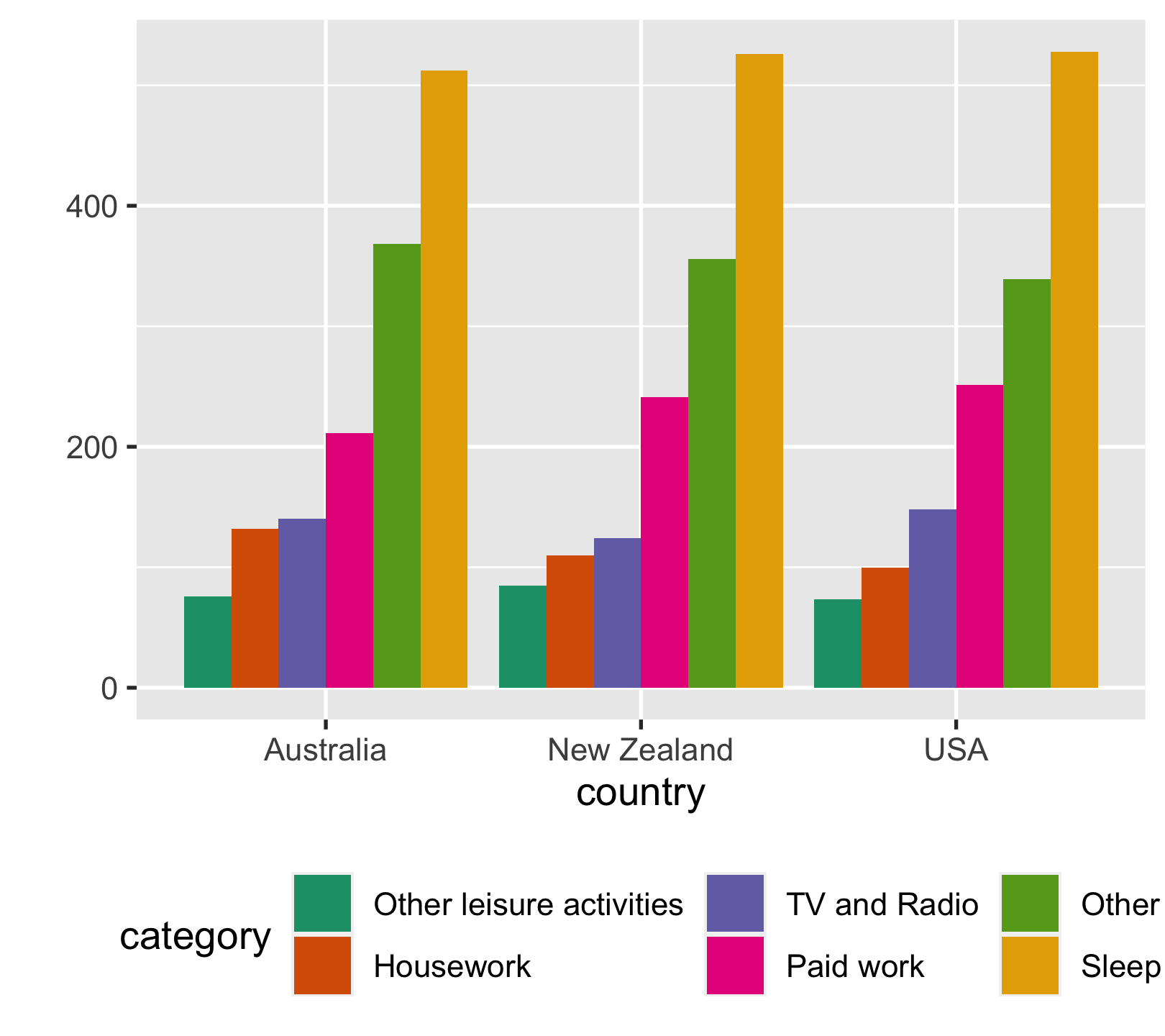
Set custom colours
time_use %>% ggplot(aes(country, time_minutes)) + geom_col( aes(fill = category), position = "dodge") + scale_fill_manual( values = c("#EF476F", "#FFD166", "#06D6A0", "#118AB2", "#073B4C", "grey")) + labs(y = "") + theme(legend.position = "bottom")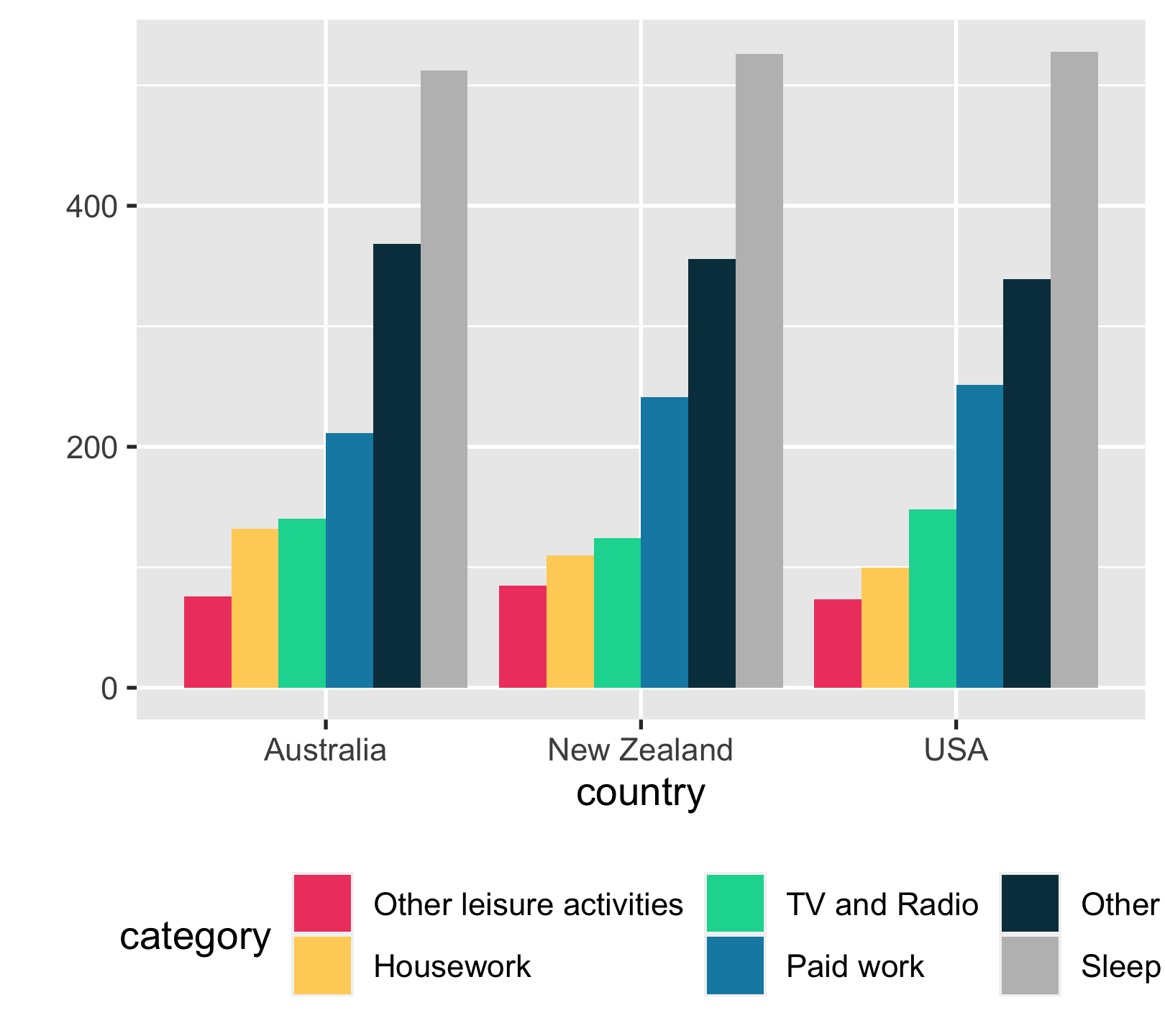
Colour-vision deficiency
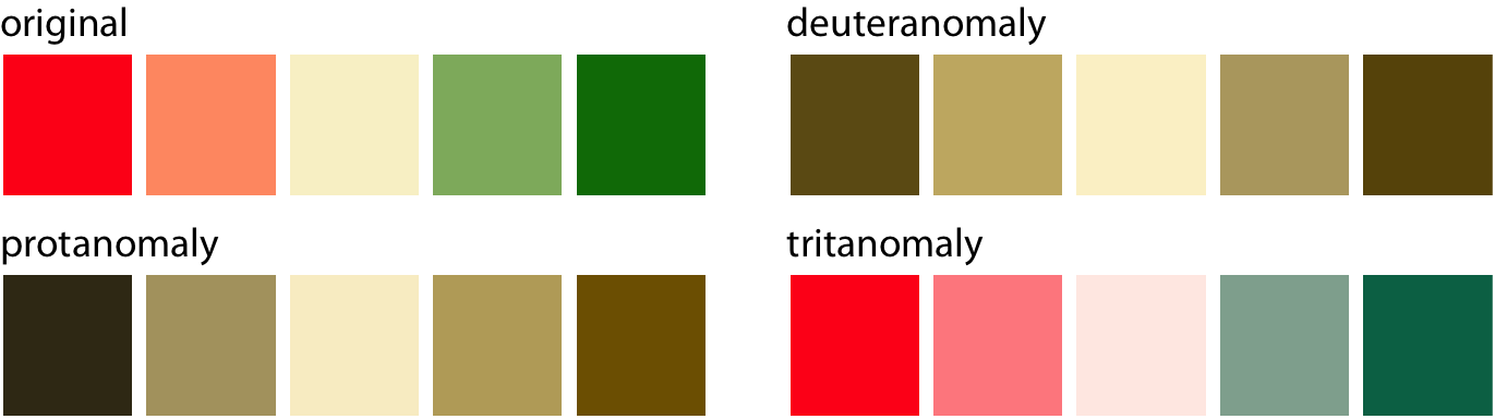
- Red-green colour-vision deficiency (deuteranomaly & protanomaly) is the most common.
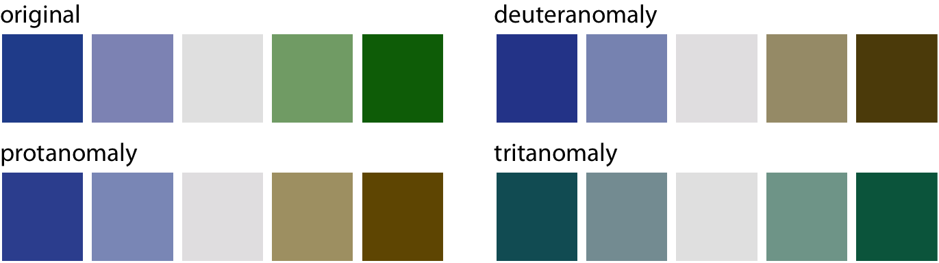
- Blue-green colour-vision deficiency (tritanomaly) is rare but does occur.
ℹ️ Approximately 8% of males and 0.5% of females suffer from some sort of color-vision deficiency.
reference: Claus O. Wilke Fundamentals of Data Visualization
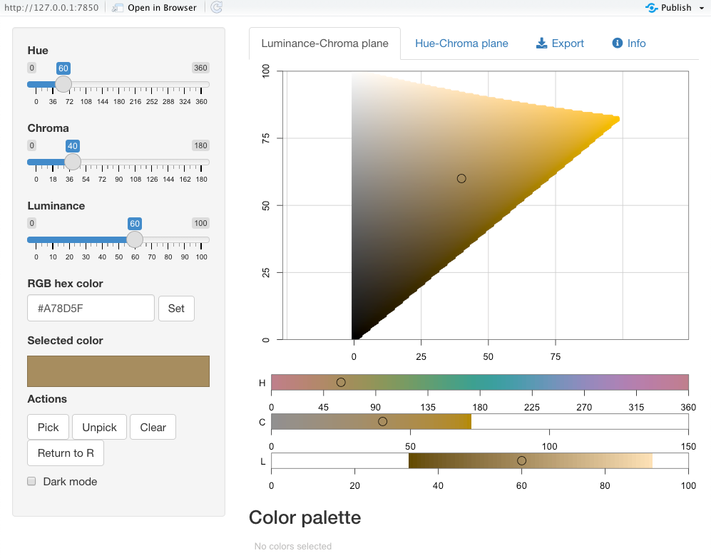
Choose colours using {colorspace}
colorspace::hclwizard()
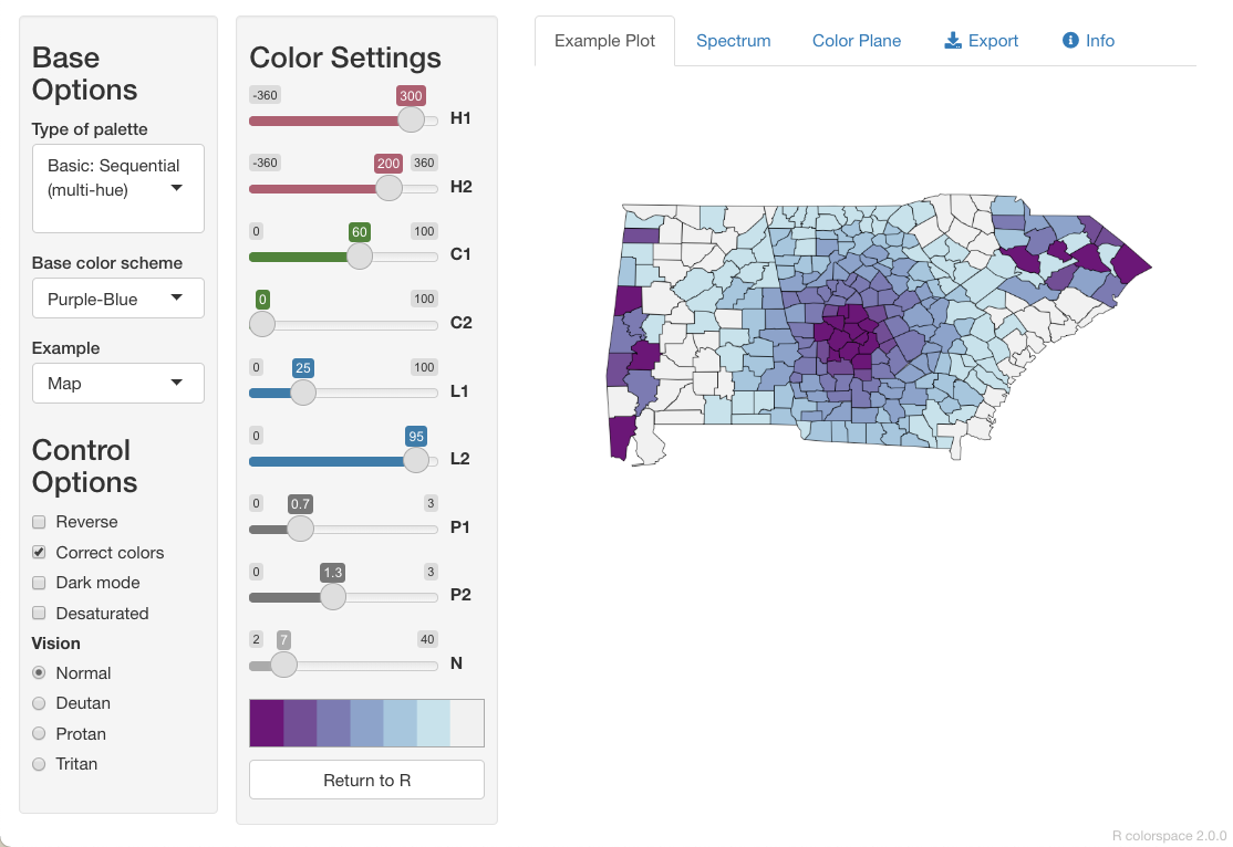
colorspace::hcl_color_picker()
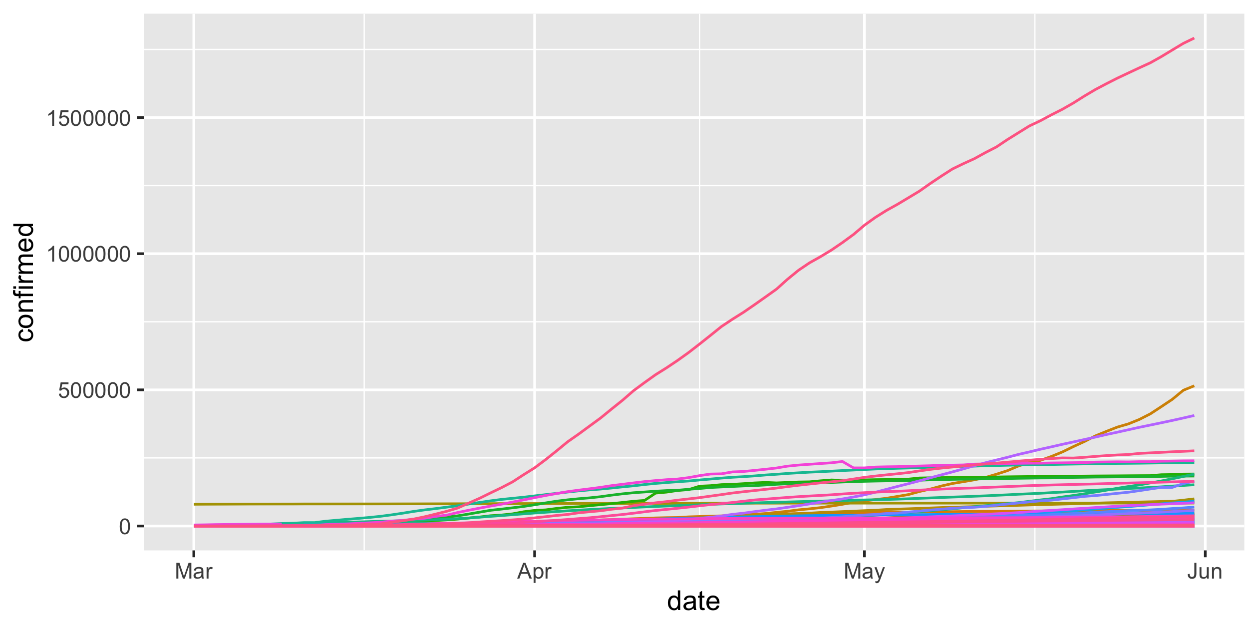
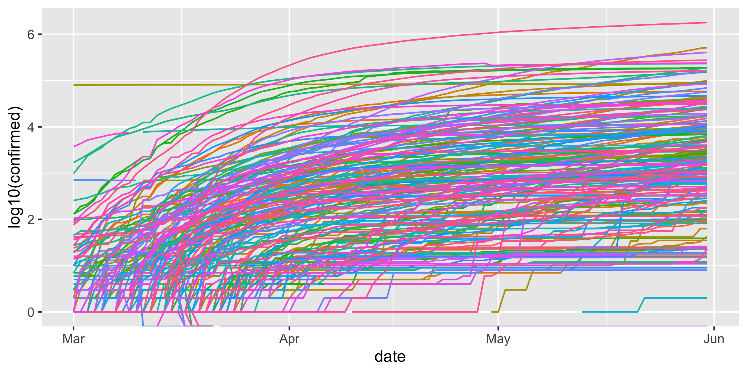
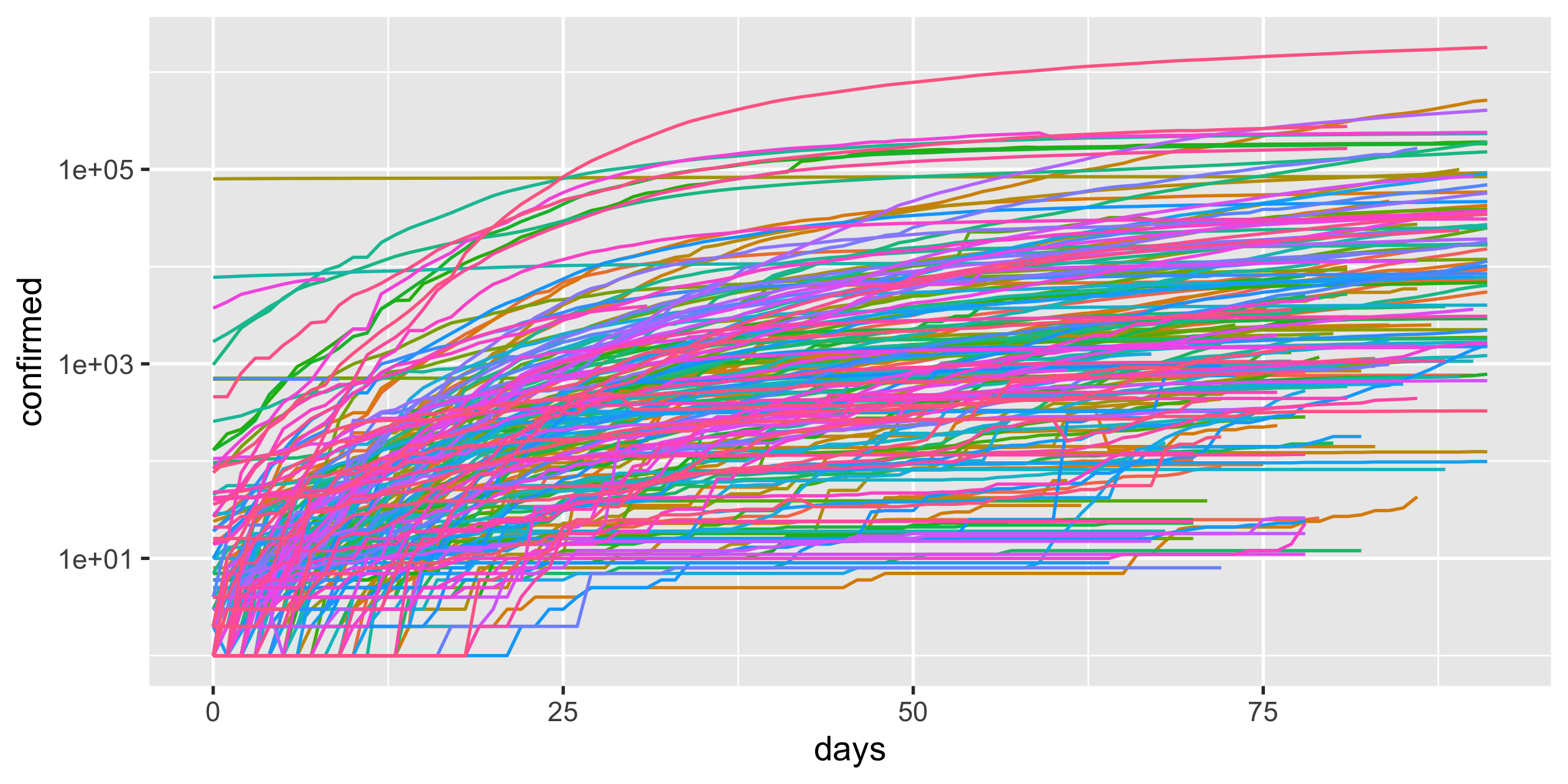
COVID-19
- scale-y
Logarithmic scale
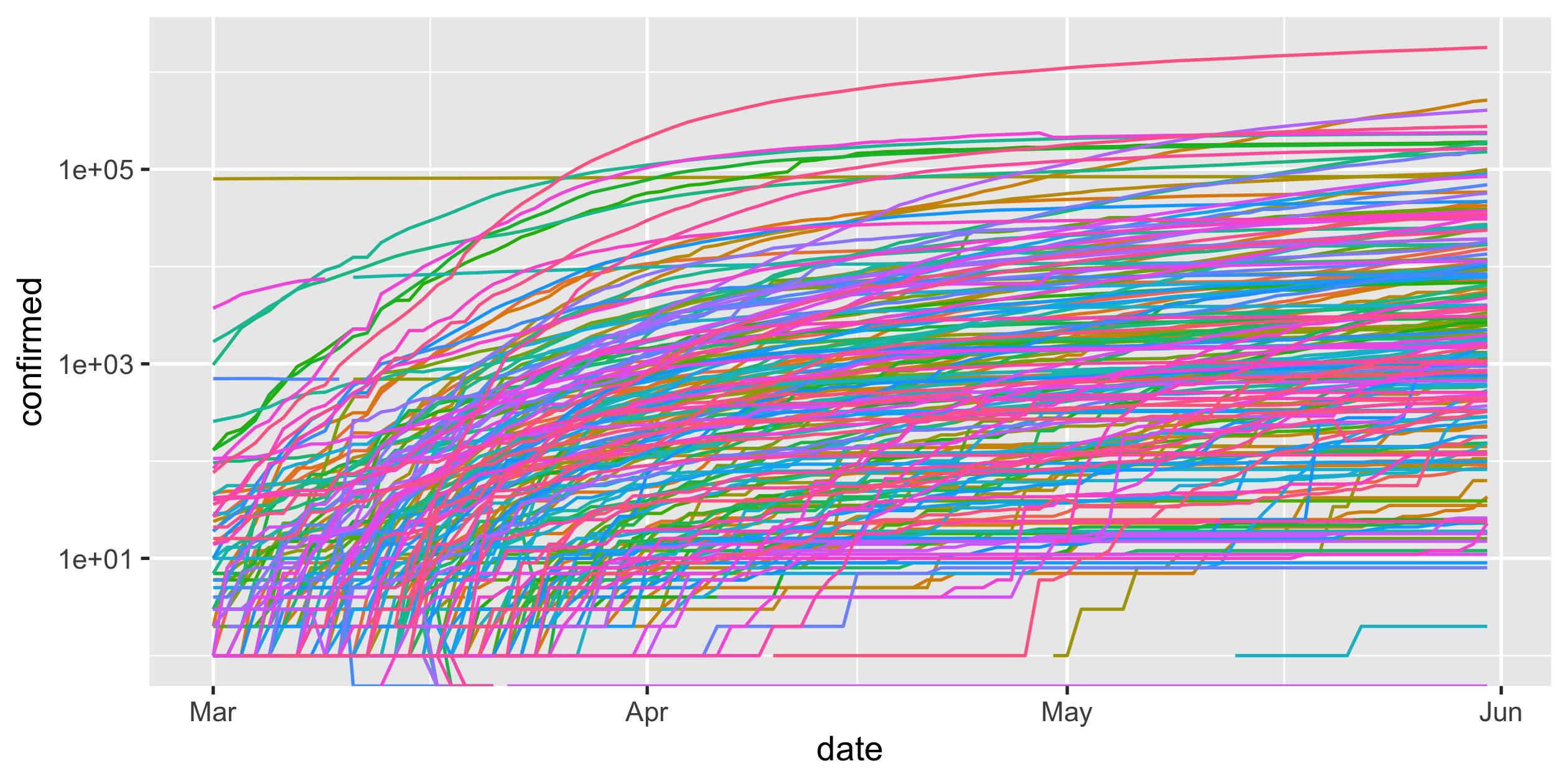
covid19 %>% ggplot(aes( x = date, y = confirmed, colour = country_region)) + geom_line() + guides(colour = FALSE) + scale_y_log10()Rob J Hyndman's blog post on Why log ratios are useful for tracking COVID-19
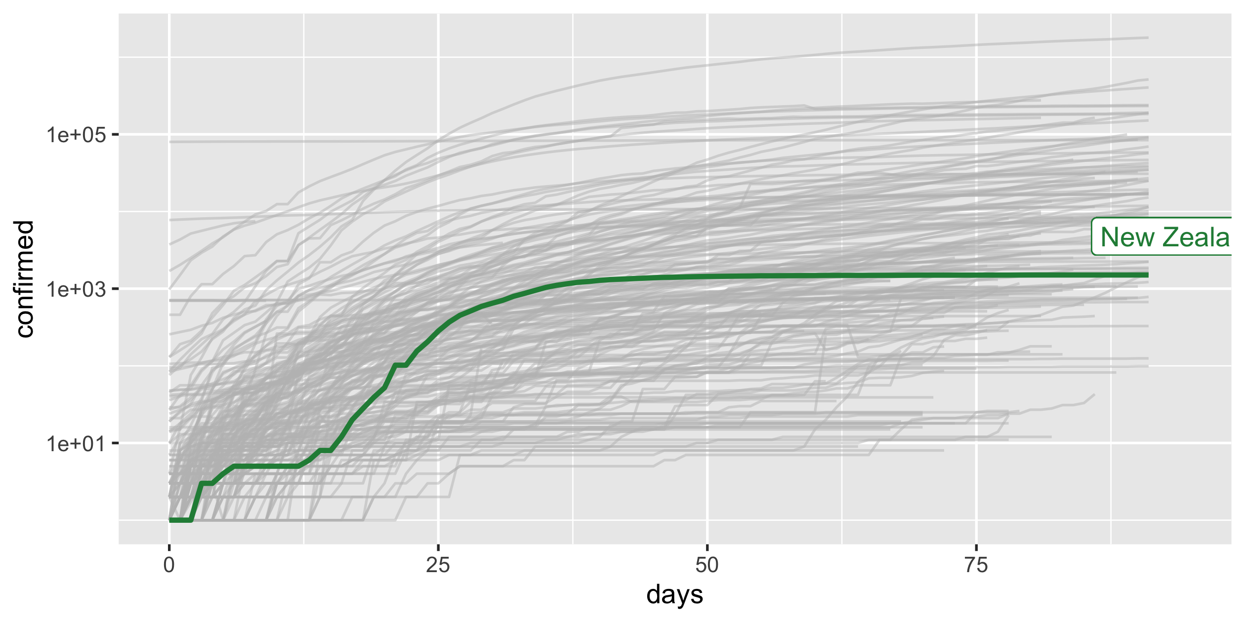
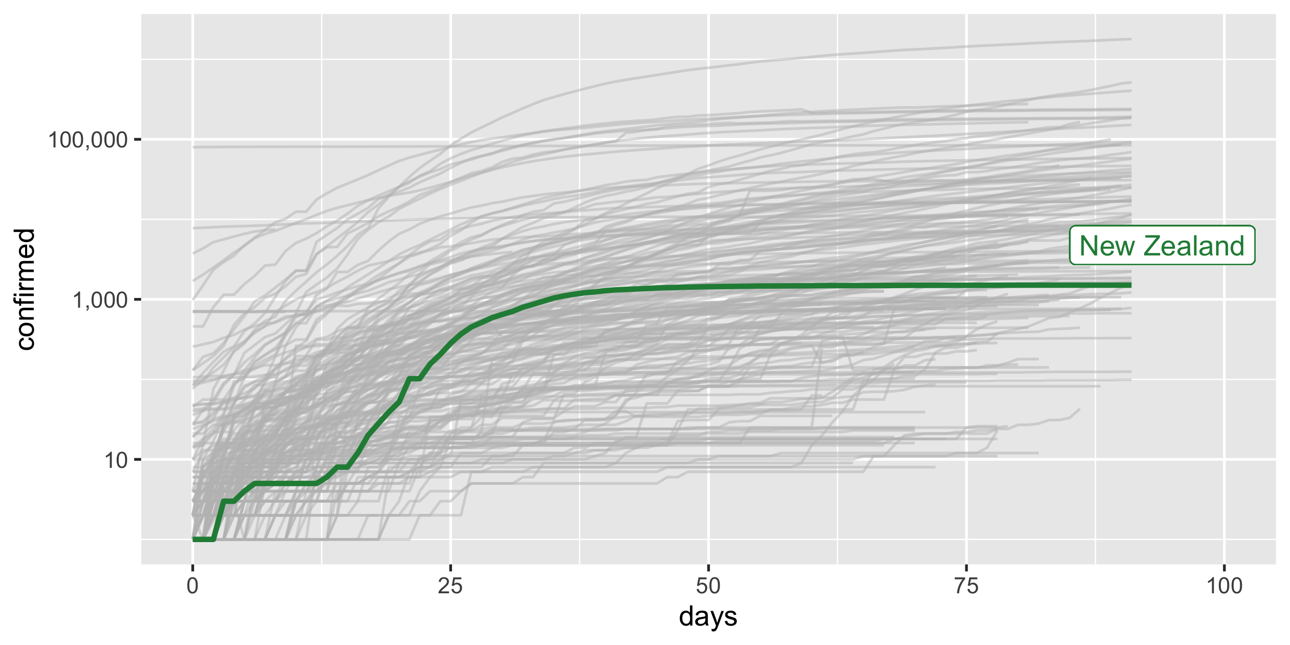
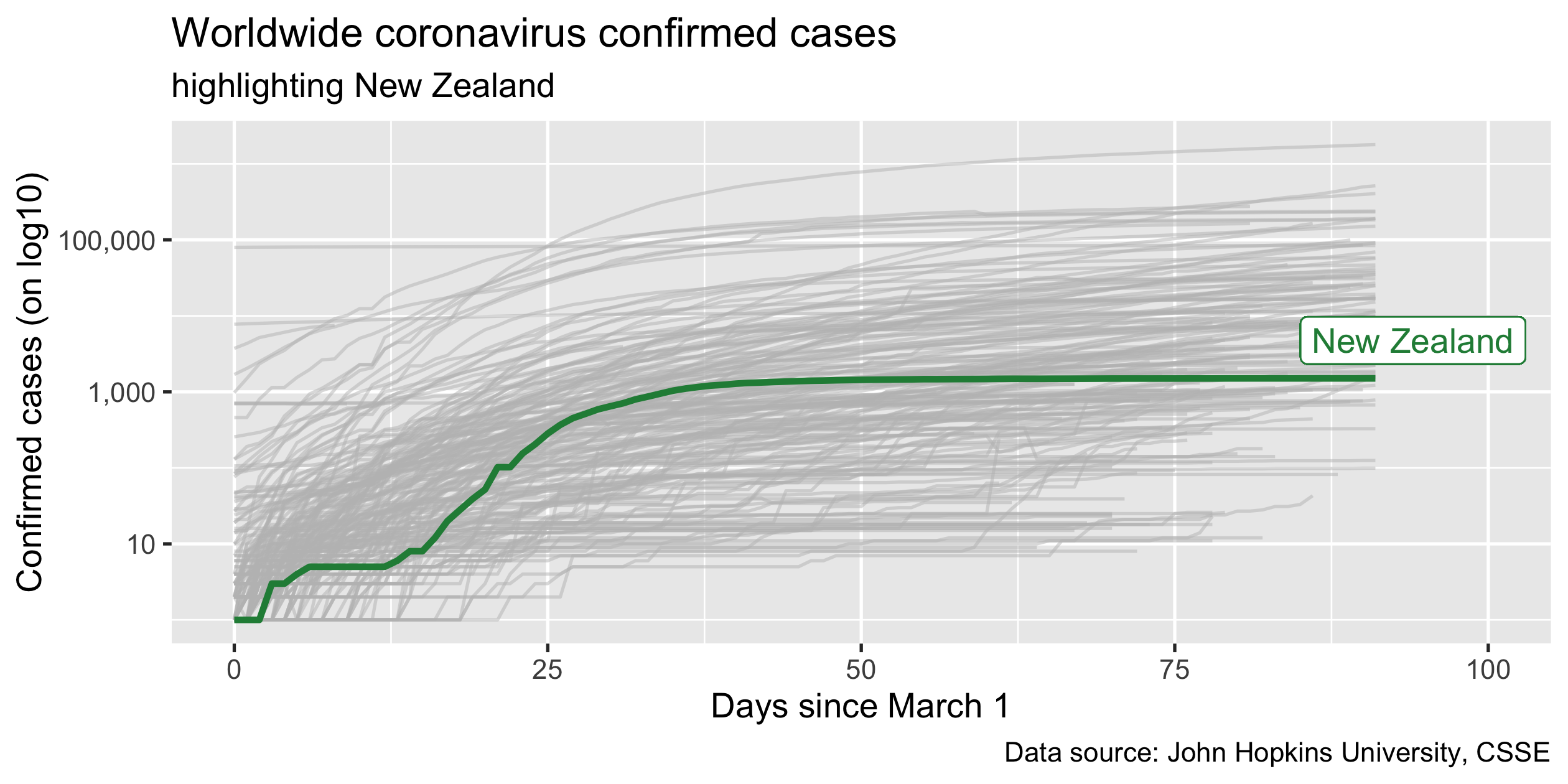
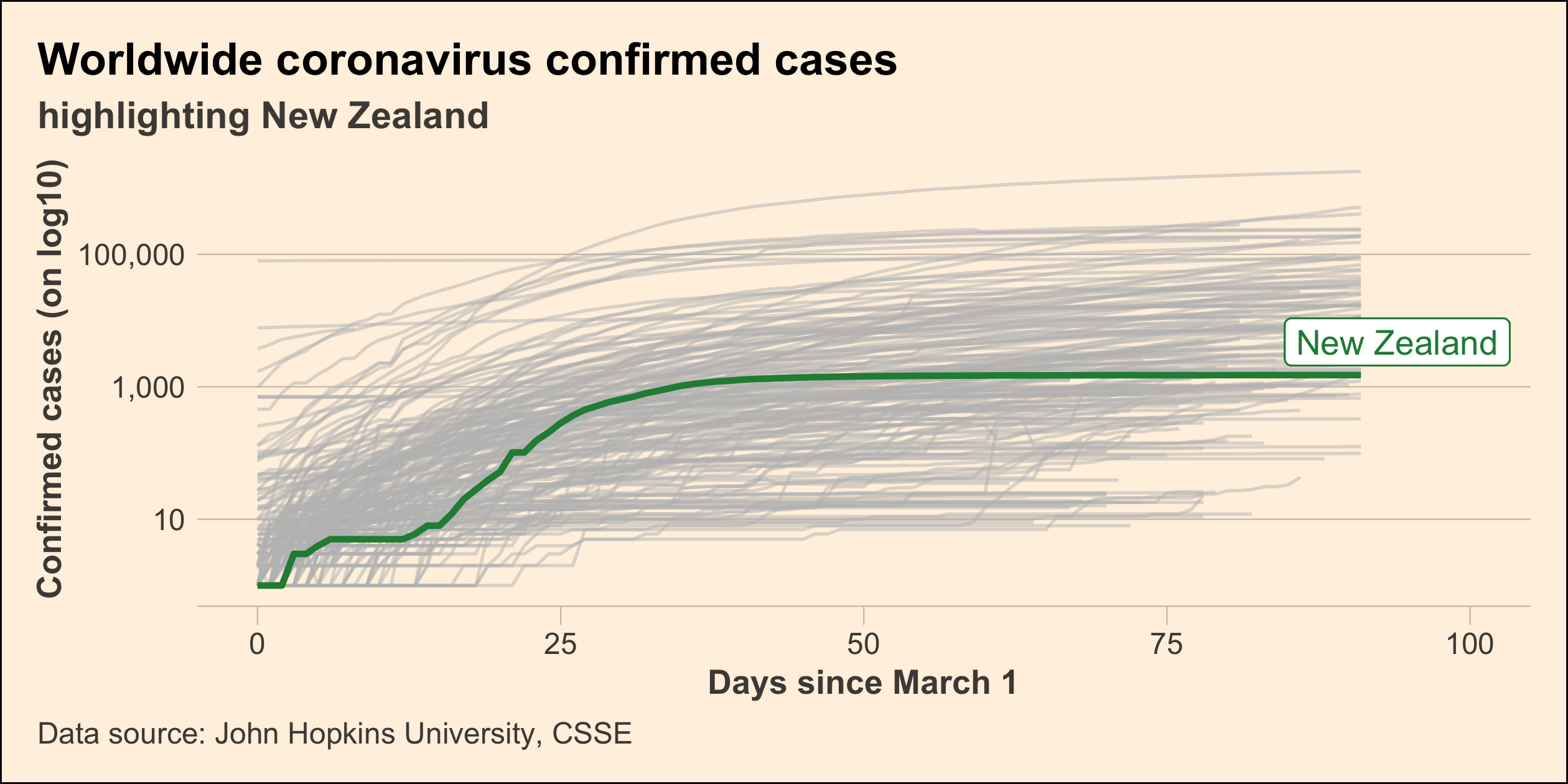
COVID-19
- scale-y
- scale-x
- highlight
Highlight New Zealand
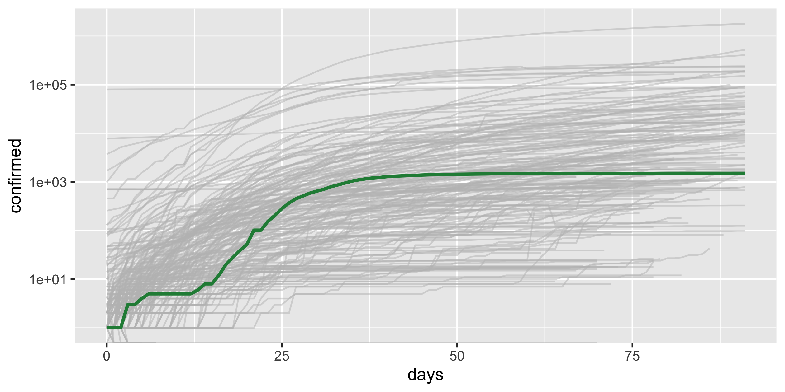
covid19_nz <- covid19_rel %>% filter(country_region == "New Zealand")p_nz <- covid19_rel %>% ggplot(aes(x = days, y = confirmed, group = country_region)) + geom_line(colour = "grey", alpha = 0.5) + geom_line(colour = "#238b45", size = 1, data = covid19_nz) + scale_y_log10() + guides(colour = FALSE)p_nz