Assignment 2
This assignment is due 23:59 Friday 30 April (NZST).
- You should submit an R file (i.e. file extension
.R) containing R code that assigns the appropriate values to the appropriate symbols. - Your R file will be executed in order and checked against the values that have been assigned to the relevant symbols using an automatic grading system. Marks will be fully deducted for non-identical results.
- Intermediate steps to achieve the final results will NOT be checked.
- Each question is worth 1 point.
- You should submit your R file on Canvas.
- Late assignments are NOT accepted unless prior arrangement for medical/compassionate reasons.
In this assignment, you will continue working with 2018 Citi Bike trip
data in New York City (2018-citibike-tripdata.csv). The data includes:
- Trip Duration (seconds)
- Start Time and Date
- Stop Time and Date
- Start Station Name
- End Station Name
- Station ID
- Station Lat/Long
- Bike ID
- User Type (Customer = 24-hour pass or 3-day pass user; Subscriber = Annual Member)
- Gender (0=unknown; 1=male; 2=female)
- Year of Birth
You shall use the following code snippet (and include them upfront in your R file) to start with this assignment:
library(lubridate)
library(tidyverse)
nycbikes18 <- read_csv("data/2018-citibike-tripdata.csv",
  locale = locale(tz = "America/New_York"))
nycbikes18
#> # A tibble: 333,687 x 15
#>    tripduration starttime           stoptime
#>           <dbl> <dttm>              <dttm>
#>  1          932 2018-01-01 02:06:17 2018-01-01 02:21:50
#>  2          550 2018-01-01 12:06:18 2018-01-01 12:15:28
#>  3          510 2018-01-01 12:06:56 2018-01-01 12:15:27
#>  4          354 2018-01-01 14:53:10 2018-01-01 14:59:05
#>  5          250 2018-01-01 17:34:30 2018-01-01 17:38:40
#>  6          613 2018-01-01 22:05:05 2018-01-01 22:15:19
#>  7          290 2018-01-02 12:13:51 2018-01-02 12:18:42
#>  8          381 2018-01-02 12:50:03 2018-01-02 12:56:24
#>  9          318 2018-01-02 13:55:58 2018-01-02 14:01:16
#> 10         1852 2018-01-02 16:55:29 2018-01-02 17:26:22
#> # … with 333,677 more rows, and 12 more variables:
#> #   start_station_id <dbl>, start_station_name <chr>,
#> #   start_station_latitude <dbl>, start_station_longitude <dbl>,
#> #   end_station_id <dbl>, end_station_name <chr>,
#> #   end_station_latitude <dbl>, end_station_longitude <dbl>,
#> #   bikeid <dbl>, usertype <chr>, birth_year <dbl>, gender <dbl>
Suppose that you have created an Rproj for this course. You need to
download 2018-citibike-tripdata.csv
here
to data/ under your Rproj folder.
- You’re required to use relative file paths
data/2018-citibike-tripdata.csvto import the data. NO marks will be given for using URL links or different file paths for this assignment. - NO marks given to the question, in which you apply
theme()and aesthetics other than what I instruct to the plot.
Question 1
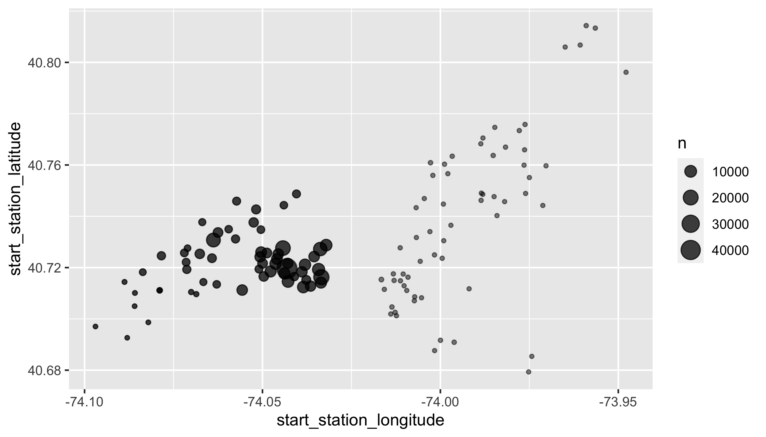
Let’s take a second look 😉 at where Citi bike stations are located. Visualise the following layered bubble charts:
- points of all start stations. Sizes vary with the total number of pickups.
- points of all end stations. Sizes vary with the total number of returns.
You should end up with a ggplot object named p1, with
alpha = 0.5 to both layers.
HINTS
- Check out the
{ggplot2}
reference page for a handy
geom_*()to quickly get this done.
p1
Question 2
Find the most frequently used bike’s data records.
You should end up with a tibble called top_bike_trips.
top_bike_trips
#> # A tibble: 825 x 15
#>    tripduration starttime           stoptime
#>           <dbl> <dttm>              <dttm>
#>  1          520 2018-01-03 13:06:21 2018-01-03 13:15:01
#>  2          232 2018-01-03 17:01:21 2018-01-03 17:05:14
#>  3          315 2018-01-14 15:08:14 2018-01-14 15:13:30
#>  4          266 2018-01-23 14:57:30 2018-01-23 15:01:57
#>  5          162 2018-01-24 17:01:10 2018-01-24 17:03:53
#>  6          150 2018-01-25 18:26:58 2018-01-25 18:29:29
#>  7          272 2018-01-03 08:49:11 2018-01-03 08:53:43
#>  8          315 2018-01-20 14:06:28 2018-01-20 14:11:44
#>  9          322 2018-01-02 15:43:42 2018-01-02 15:49:04
#> 10          251 2018-01-10 17:48:03 2018-01-10 17:52:14
#> # … with 815 more rows, and 12 more variables:
#> #   start_station_id <dbl>, start_station_name <chr>,
#> #   start_station_latitude <dbl>, start_station_longitude <dbl>,
#> #   end_station_id <dbl>, end_station_name <chr>,
#> #   end_station_latitude <dbl>, end_station_longitude <dbl>,
#> #   bikeid <dbl>, usertype <chr>, birth_year <dbl>, gender <dbl>
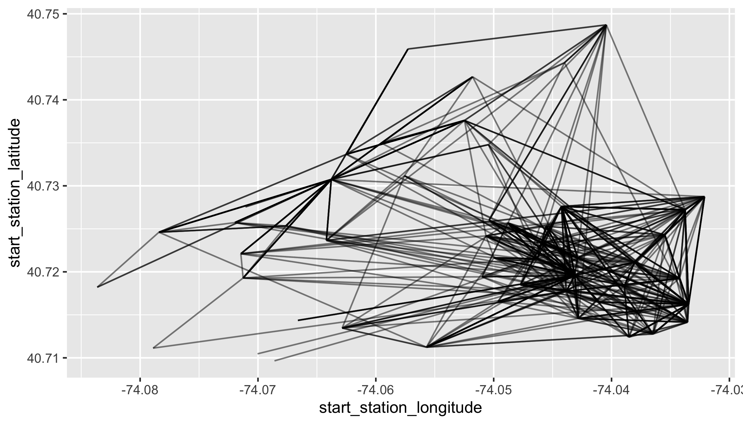
Question 3
Plot all journeys that the most frequently used bike has travelled on.
You should end up with a ggplot called p2, with alpha = 0.5.
p2
Question 4
In order to study different riding behaviours by age groups, you’ll
transform nycbikes18 to a tibble called nycbikes18_age:
- modify
tripdurationto be converted in minutes. - when
birth_yearis less than 1900, replace values withNA_real_. - add a new column
agederived from user’s birth year based on 2018. - add a new column
age_groupthat binsageinto groups: 0-14, 15-24, 25-44, 45-64, 65+.
glimpse(nycbikes18_age)
#> Rows: 333,687
#> Columns: 17
#> $ tripduration            <dbl> 15.533333, 9.166667, 8.500000, 5.900…
#> $ starttime               <dttm> 2018-01-01 02:06:17, 2018-01-01 12:…
#> $ stoptime                <dttm> 2018-01-01 02:21:50, 2018-01-01 12:…
#> $ start_station_id        <dbl> 3183, 3183, 3183, 3183, 3183, 3183, …
#> $ start_station_name      <chr> "Exchange Place", "Exchange Place", …
#> $ start_station_latitude  <dbl> 40.71625, 40.71625, 40.71625, 40.716…
#> $ start_station_longitude <dbl> -74.03346, -74.03346, -74.03346, -74…
#> $ end_station_id          <dbl> 3199, 3199, 3199, 3267, 3639, 3203, …
#> $ end_station_name        <chr> "Newport Pkwy", "Newport Pkwy", "New…
#> $ end_station_latitude    <dbl> 40.72874, 40.72874, 40.72874, 40.712…
#> $ end_station_longitude   <dbl> -74.03211, -74.03211, -74.03211, -74…
#> $ bikeid                  <dbl> 31929, 31845, 31708, 31697, 31861, 3…
#> $ usertype                <chr> "Subscriber", "Subscriber", "Subscri…
#> $ birth_year              <dbl> 1992, 1969, 1946, 1994, 1991, 1982, …
#> $ gender                  <dbl> 1, 2, 1, 1, 1, 1, 1, 2, 1, 1, 2, 1, …
#> $ age                     <dbl> 26, 49, 72, 24, 27, 36, 60, 29, 58, …
#> $ age_group               <fct> "(24,44]", "(44,64]", "65+", "(14,24…
sum(is.na(nycbikes18_age$birth_year))
#> [1] 126
mean(nycbikes18_age$age, na.rm = TRUE)
#> [1] 37.63694
levels(nycbikes18_age$age_group)
#> [1] "[0,14]" "(14,24]" "(24,44]" "(44,64]" "65+"
Question 5
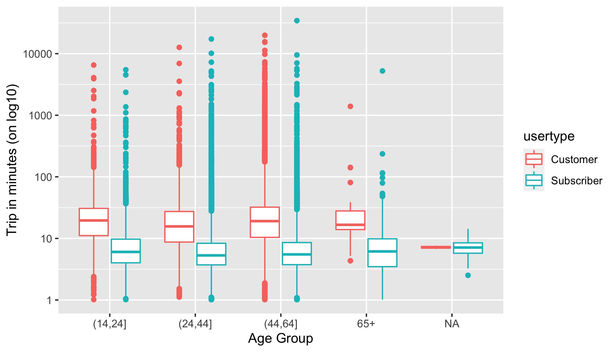
Generate a side-by-side boxplot to demonstrate the differences of trip durations across age groups coloured by user types. (NOTE: you need to modify labels of this plot.)
You should end up with a ggplot called p3, with
- labeling
"Age Group"to x axis - labeling
"Trip in minutes (on log10)"to y axis
p3
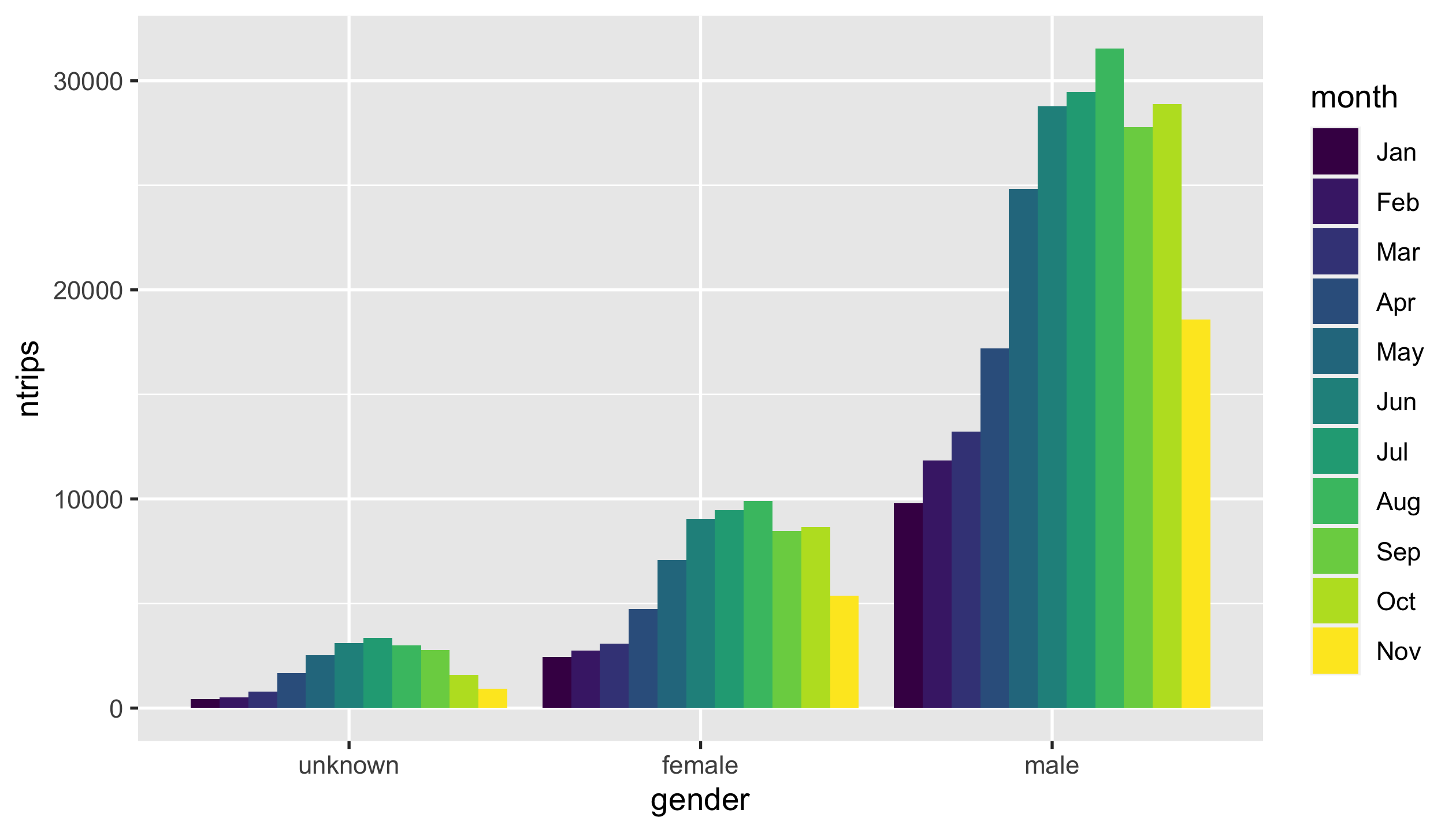
Question 6
Plot a grouped bar chart that sums up the number of trips by months of
startime and gender.
Intermediate data for the plot looks like as follows:
#> # A tibble: 33 x 3
#>    month gender  ntrips
#>    <ord> <fct>    <int>
#>  1 Jan   unknown    428
#>  2 Jan   male      9798
#>  3 Jan   female    2451
#>  4 Feb   unknown    498
#>  5 Feb   male     11849
#>  6 Feb   female    2757
#>  7 Mar   unknown    794
#>  8 Mar   male     13231
#>  9 Mar   female    3084
#> 10 Apr   unknown   1676
#> # … with 23 more rows
You should end up with a ggplot called p4.
HINTS
Key steps:
- extract months of
starttime. - modify
gender.
p4
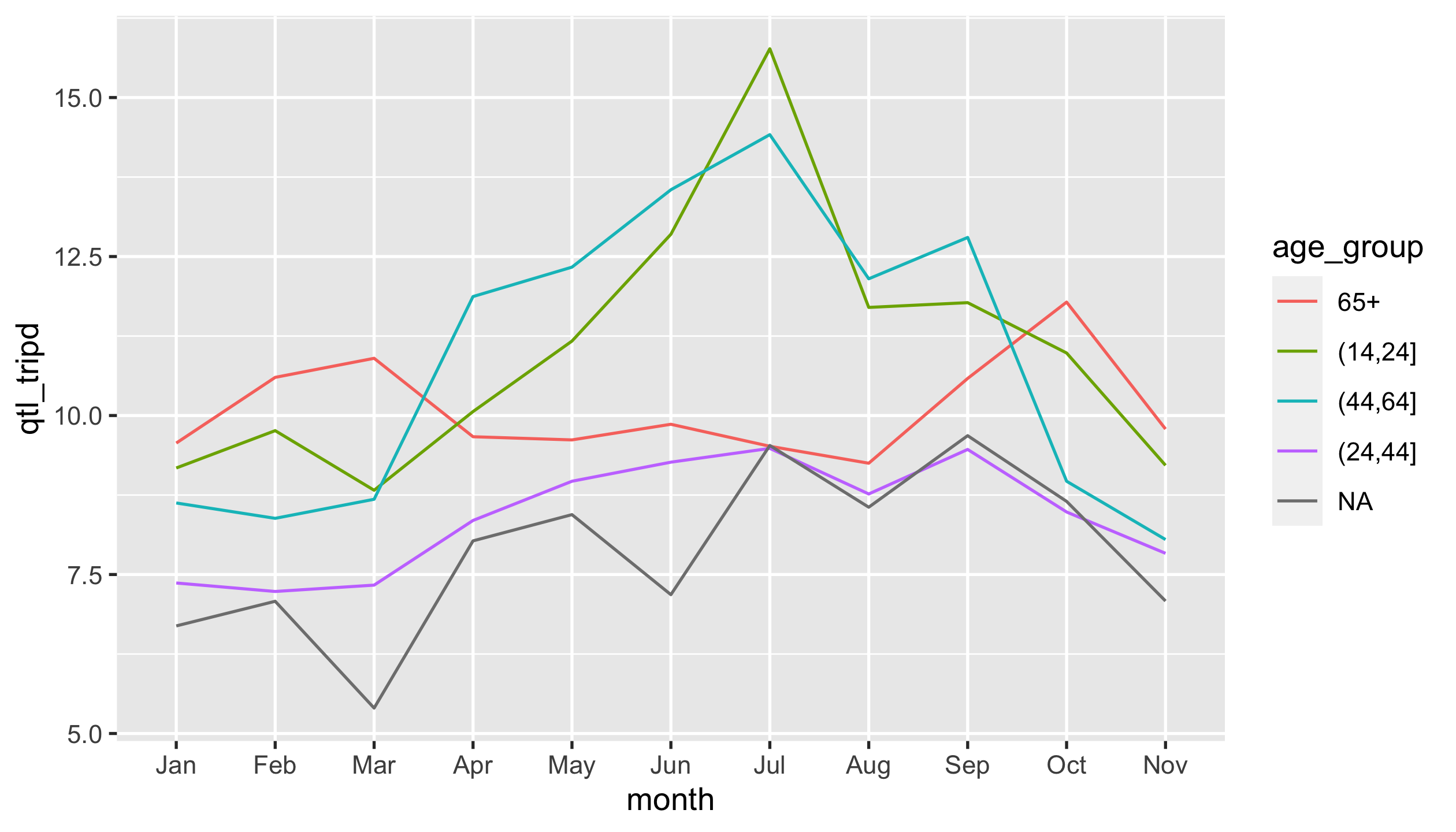
Question 7
Produce a line graph depicting the 3rd quantile of trip durations by
months of starttime and age groups. (NOTE: check out the legend
order that matches to the last value of each line.)
Intermediate data for the plot looks like as follows:
#> # A tibble: 55 x 3
#>    month age_group qtl_tripd
#>    <ord> <fct>         <dbl>
#>  1 Jan   (14,24]        9.18
#>  2 Jan   (24,44]        7.37
#>  3 Jan   (44,64]        8.62
#>  4 Jan   65+            9.57
#>  5 Jan   <NA>           6.69
#>  6 Feb   (14,24]        9.76
#>  7 Feb   (24,44]        7.23
#>  8 Feb   (44,64]        8.38
#>  9 Feb   65+           10.6
#> 10 Feb   <NA>           7.08
#> # … with 45 more rows
You should end up with a ggplot called p5.
HINTS
- Check out the
{forcats}
reference page for a function that you can reorder the levels of
age_groupas required. - You need to use
aes(group = <GROUP>)to show lines.
p5
Question 8
Present the following pivot table that counts the number of trips by
upper-tail user’s types and age groups. Upper-tail users are defined
as the ones who ride for longer periods than 90% of users of the same
age group. (NOTE: the column headers of user_behaviours)
You should end up with a tibble called user_behaviours.
HINTS
Key steps:
- subset.
- summarise.
- pivot.
user_behaviours
#> # A tibble: 5 x 3
#>   `Age Group` Customer Subscriber
#>   <fct>          <int>      <int>
#> 1 (14,24]          641        706
#> 2 (24,44]         3749      19864
#> 3 (44,64]         4760       3275
#> 4 65+               25        289
#> 5 <NA>              NA         13
Question 9
You’re going to get nycbikes18 prepared in a form for the final
question:
- modify
starttimedown to the nearest hour. - aggregate to hourly number of trips (denoted as
ntrips) by user types. - add new columns
startdate,starthour, andstartwdaythat contain dates, hours of the day, and weekdays respectively extracted fromstarttime.
You should end up with a tibble called hourly_ntrips.
hourly_ntrips
#> # A tibble: 11,739 x 6
#>    starttime           usertype  ntrips startdate  starthour startwday
#>    <dttm>              <chr>      <int> <date>         <int> <ord>
#>  1 2018-01-01 00:00:00 Subscrib…      1 2018-01-01         0 Mon
#>  2 2018-01-01 01:00:00 Subscrib…      3 2018-01-01         1 Mon
#>  3 2018-01-01 02:00:00 Subscrib…      3 2018-01-01         2 Mon
#>  4 2018-01-01 03:00:00 Subscrib…      7 2018-01-01         3 Mon
#>  5 2018-01-01 04:00:00 Subscrib…      1 2018-01-01         4 Mon
#>  6 2018-01-01 06:00:00 Subscrib…      2 2018-01-01         6 Mon
#>  7 2018-01-01 08:00:00 Subscrib…      5 2018-01-01         8 Mon
#>  8 2018-01-01 09:00:00 Subscrib…      2 2018-01-01         9 Mon
#>  9 2018-01-01 10:00:00 Subscrib…      4 2018-01-01        10 Mon
#> 10 2018-01-01 11:00:00 Subscrib…      3 2018-01-01        11 Mon
#> # … with 11,729 more rows
mean(hourly_ntrips$starttime)
#> [1] "2018-06-29 14:11:53 EDT"
mean(hourly_ntrips$ntrips)
#> [1] 28.4255
levels(hourly_ntrips$startwday)
#> [1] "Mon" "Tue" "Wed" "Thu" "Fri" "Sat" "Sun"
Question 10
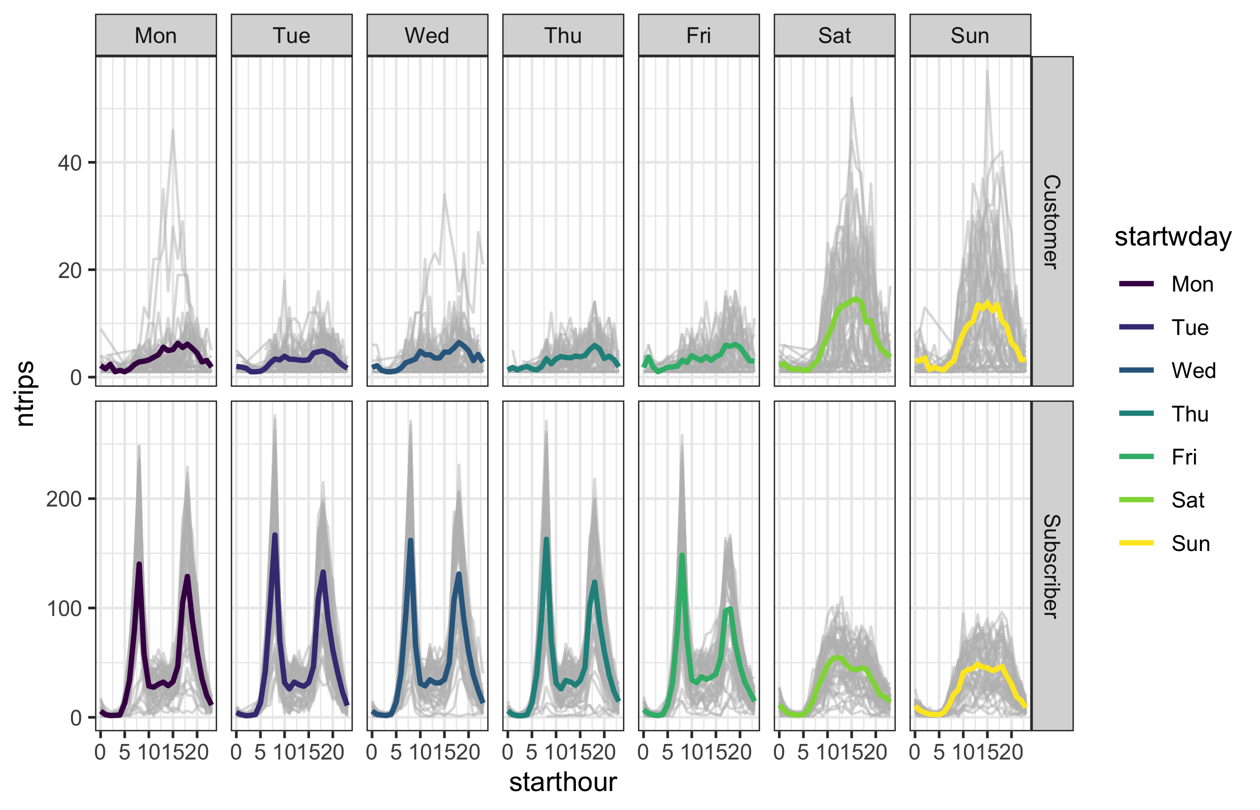
Let’s look at user behaviours between Subscriber and Customer in temporal context. Visualise the following layered graphics, faceted by weekdays and user types:
- grey lines indicating the hourly number of trips against time of the
day from
hourly_ntrips, withcolour = "#bdbdbd"andalpha = 0.5. - superimposed lines indicating the average number of trips by hours
of the day, weekdays, and user types, with
size = 1.
You should end up with a ggplot object named p6 with a
black-and-white theme.
HINTS
Oops! No hints for this question.p6
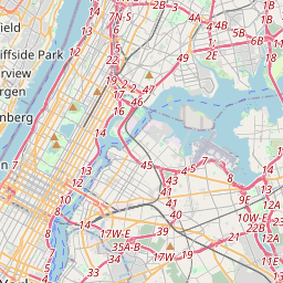
Question4fun (NO marks)
Create an interactive map that marks all bike stations in clusters. By zooming in and out, you can see how clusters change. By hovering individual markers, you should be able to query the station name.
library(leaflet)