Lab 07
This lab exercise is due 23:59 Monday 10 May (NZST).
- You should submit an R file (i.e. file extension
.R) containing R code that assigns the appropriate values to the appropriate symbols. - Your R file will be executed in order and checked against the values that have been assigned to the symbols using an automatic grading system. Marks will be fully deducted for non-identical results.
- Intermediate steps to achieve the final results will NOT be checked.
- Each question is worth 0.2 points.
- You should submit your R file on Canvas.
- Late assignments are NOT accepted unless prior arrangement for medical/compassionate reasons.
In this lab exercise, you are going to work on the alternative
visualisation of “Flattening the
curve” for the publication purpose,
using covid19-daily-cases.csv that contains cumulative daily confirmed
cases between 2020-03-01 and 2020-05-31 around the world. You shall use
the following code snippet (and include them upfront in your R file)
for this lab session:
library(scales)
library(tidyverse)
selected <- c("Australia", "Brazil", "Canada", "China", "France", "Germany",
  "India", "Israel", "Italy", "Japan", "Korea, South", "New Zealand",
  "Spain", "Sweden", "United Kingdom", "US")
covid19 <- read_csv("data/covid19-daily-cases.csv") %>%
  filter(country_region %in% selected)
covid19
#> # A tibble: 1,452 x 3
#>    country_region date       confirmed
#>    <chr>          <date>         <dbl>
#>  1 Australia      2020-03-01        27
#>  2 Australia      2020-03-02        30
#>  3 Australia      2020-03-03        39
#>  4 Australia      2020-03-04        52
#>  5 Australia      2020-03-05        55
#>  6 Australia      2020-03-06        60
#>  7 Australia      2020-03-07        63
#>  8 Australia      2020-03-08        76
#>  9 Australia      2020-03-09        91
#> 10 Australia      2020-03-10       107
#> # … with 1,442 more rows
Suppose that you have created an Rproj for this course. You need to
download covid19-daily-cases.csv
here,
to data/ under your Rproj folder.
- You’re required to use relative file paths
data/covid19-daily-cases.csvto import these data. NO marks will be given to this lab for using URL links or different file paths.
Question 1
Substitute "Korea, South" with "South Korea" in country_region,
and then add a new column new_cases that computes new confirmed cases
in the past week for each region.
You should end up with a tibble called covid19_cases.
HINTS
- You may find one of {dplyr}’s vector functions useful.
covid19_cases
#> # A tibble: 1,452 x 4
#>    country_region date       confirmed new_cases
#>    <chr>          <date>         <dbl>     <dbl>
#>  1 Australia      2020-03-01        27        NA
#>  2 Australia      2020-03-02        30        NA
#>  3 Australia      2020-03-03        39        NA
#>  4 Australia      2020-03-04        52        NA
#>  5 Australia      2020-03-05        55        NA
#>  6 Australia      2020-03-06        60        NA
#>  7 Australia      2020-03-07        63        NA
#>  8 Australia      2020-03-08        76        49
#>  9 Australia      2020-03-09        91        61
#> 10 Australia      2020-03-10       107        68
#> # … with 1,442 more rows
mean(covid19_cases$new_cases, na.rm = TRUE)
#> [1] 18871.79
Question 2
Rename country_region to country_region_bg.
You should end up with a tibble called covid19_bg.
covid19_bg
#> # A tibble: 1,452 x 4
#>    country_region_bg date       confirmed new_cases
#>    <chr>             <date>         <dbl>     <dbl>
#>  1 Australia         2020-03-01        27        NA
#>  2 Australia         2020-03-02        30        NA
#>  3 Australia         2020-03-03        39        NA
#>  4 Australia         2020-03-04        52        NA
#>  5 Australia         2020-03-05        55        NA
#>  6 Australia         2020-03-06        60        NA
#>  7 Australia         2020-03-07        63        NA
#>  8 Australia         2020-03-08        76        49
#>  9 Australia         2020-03-09        91        61
#> 10 Australia         2020-03-10       107        68
#> # … with 1,442 more rows
Question 3
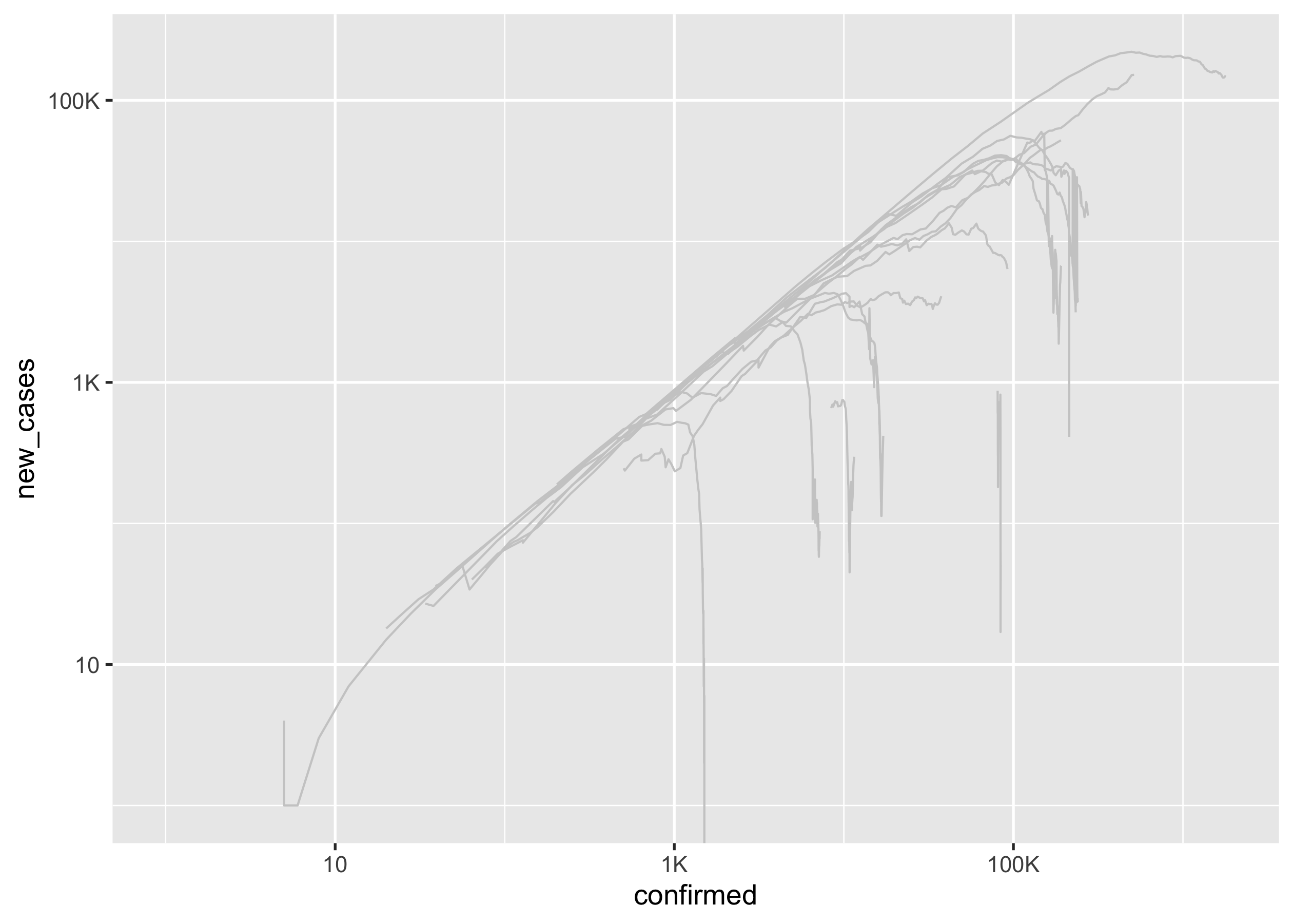
Create a line chart of new_cases vs confirmed for each region.
You should end up with a ggplot called p1, with
- lines:
colour = "gray80"andsize = 0.4, label_number_si()to axis labels and logarithmic scales applied.
p1

Question 4
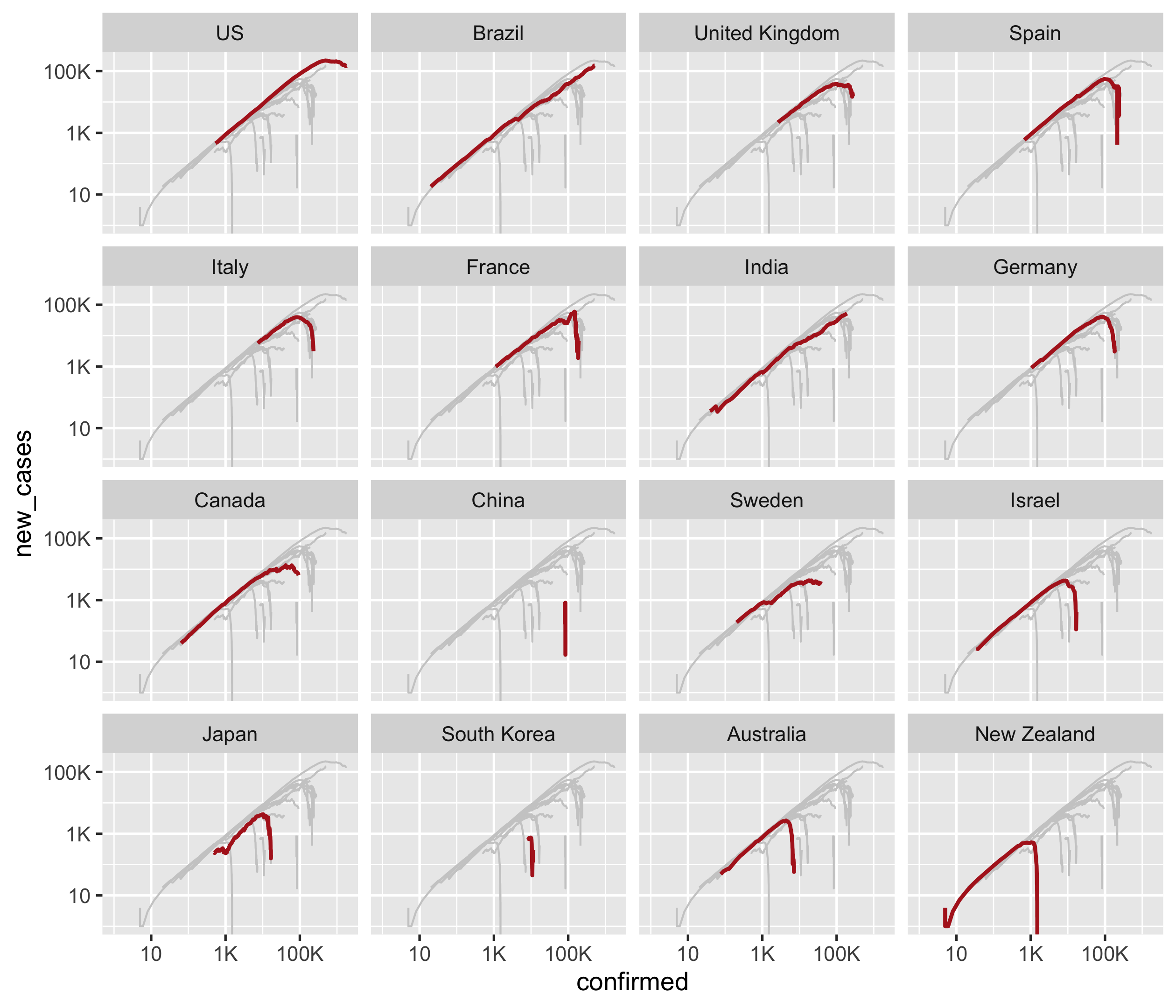
Generate a small multiples of p1 by regions ordered by their confirmed
cases on 2020-05-31 from high to low, and highlight each region with
colour = "firebrick" and size = 0.8 for each panel.
You should end up with a ggplot called p2.
p2

Question 5
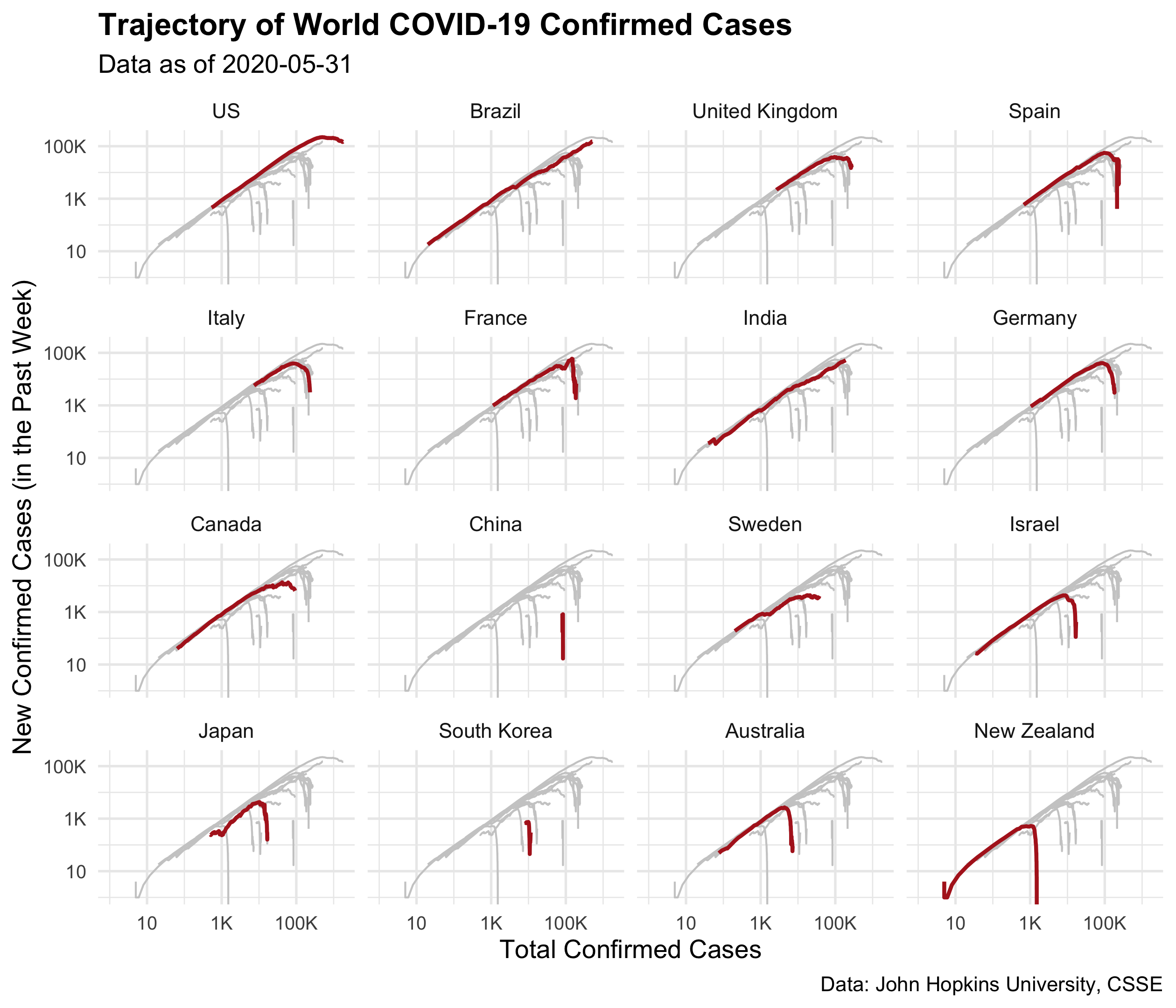
Add the following titles and labels to p2:
- x:
"Total Confirmed Cases", - y:
"New Confirmed Cases (in the Past Week)", - title:
"Trajectory of World COVID-19 Confirmed Cases", - subtitle:
"Data as of 2020-05-31", - caption:
"Data: John Hopkins University, CSSE"
You should end up with a ggplot called p3, with
- the minimal theme,
- the plot title in bold,
- setting the axis text font size to be 8.
p3

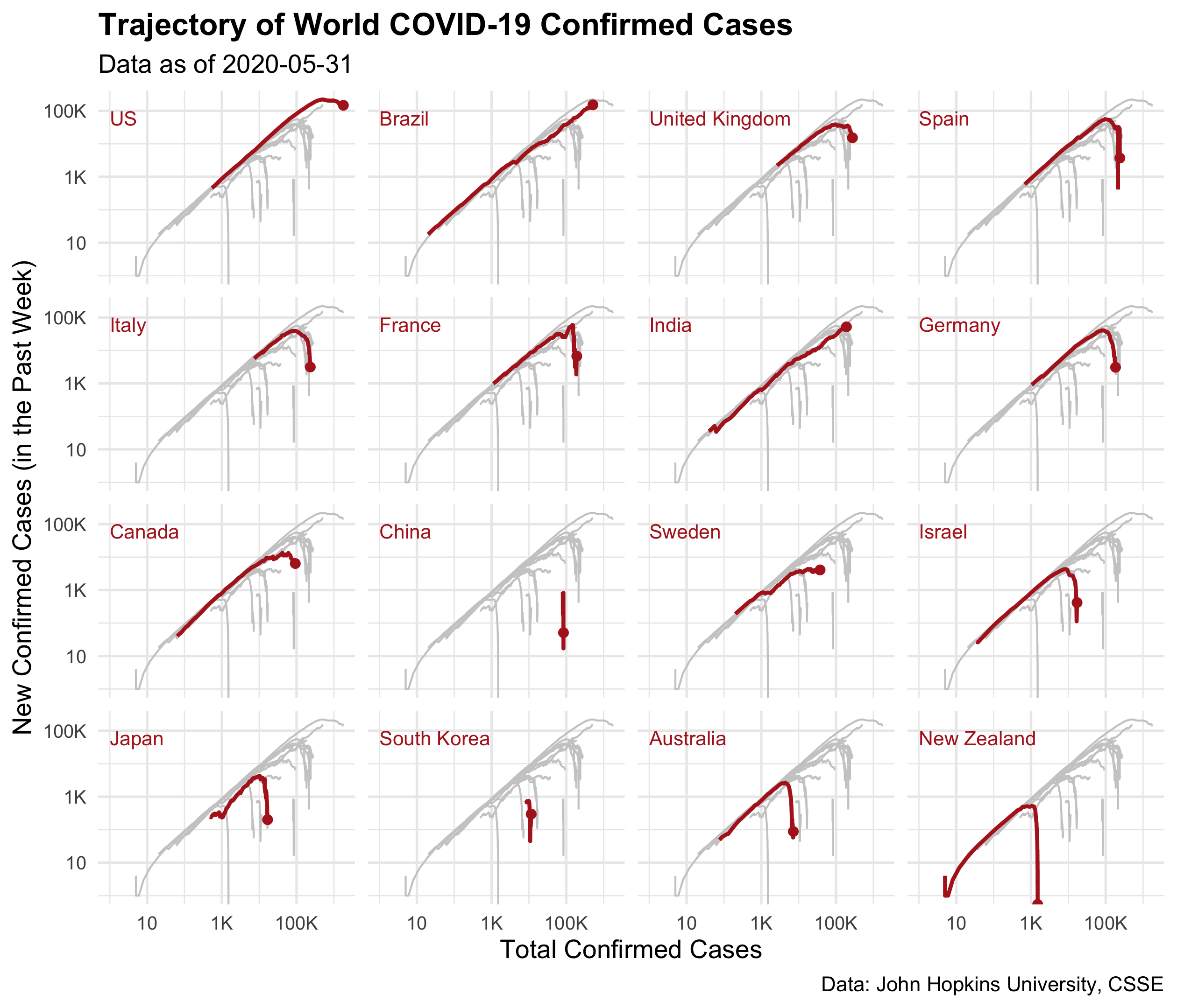
Question4fun (NO marks)
Polish p3 by:
- adding the point at the end of each highlighted line,
- placing each region labels at the top left position of each panel,
- removing facet texts.
